5 Examples of Bad Web Design: A Guide to Web Design Standards in 2026
If you just started to create a website for your small business, you may feel a little lost. Perhaps you’ve never designed a website before and don’t know what it should look like. Chances are, you’ve researched examples of well-designed websites for some inspiration. But, what about examples of bad web design?
While well-designed websites can give you an idea of what you should do when creating your own site, examples of poor web design also can help you learn what to avoid. This article will walk through five examples of badly designed websites to help you learn what not to do when building a digital touchpoint for your small business.
Looking to learn more about what your business website will need? Be sure to check out our How to Build a Website guide to find out more.
Arngren (Classified Ad Site)

This Norwegian classified ad site provides a perfect example of what to avoid when designing your website. Its homepage is a cluttered mess of listings that occupy every inch of white space. The index-style navigation menu on the far left is an exhaustive list of every category of listing on the site — with no subcategories or drop-down menus.
Finally, this bad web design example is a throwback to the early 2000s with the appearance that its owner hasn’t updated that design since then.
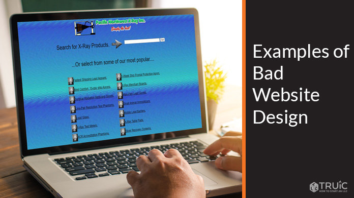
Pacific Northwest X-Ray Inc. (X-Ray Technician)

Created in 1997, this bad website design example clearly hasn’t had an update since then. Its background color is bright and oversaturated with a choppy gradient effect, and the company’s logo uses a nearly illegible font in bright green with a thick white outline.
This site also provides little valuable information about the actual products and services the company offers. Instead, it presents those offerings on the homepage as a menu of items without any proper context. In addition, the site lacks call-to-action (CTA) buttons to invite visitors to engage with the company or boost conversions.
Yale School of Art (Graduate School)
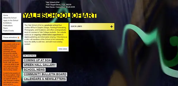
You’d expect the website for school of art within a prestigious university to exemplify the graphic design courses it offers. Not so. The Yale School of Art website is a cluttered, disorganized mess. A highlighter effect used to counter black text against a dark background renders the homepage header nearly illegible, and much of the other text is so small you’d have to zoom in to around 200 percent to properly read it.
Additionally, the entire right half of the homepage presents empty space filled only by a dated background image. Overall, this website poorly represents the reputation of the Ivy League university.
Ready to spruce up your business website design? Check out our article on Business Web Design Basics for web design tips, current industry standards, and more.
Paradise Drinking Water (Bottled Water Delivery Company)

Where to begin? This bottled water delivery company’s site uses photos that look like they were taken in the early 90s — around the same time its overly graphic logo appears to have been designed. This site also looks overstuffed with unnecessary elements, such as the bubble images on either side of the homepage.
The navigation menu includes too many options and should instead use more submenus. The website also features generally outdated fonts and graphics, yet another reason why this site has made our bad web design list.
University of Advancing Technology (Higher Education Institution)

Before it starts teaching students all about advancing technologies, this university may want to advance the usability of its website. When you visit the site’s homepage, your eyes will encounter a massive logo with unbalanced placement. To the right of that logo, an even larger video features students pulling silly faces along with changing header text that moves too fast for visitors to read.
This site does have a navigation menu, but you might easily overlook it because it’s hidden in the lower-left corner of the page. When you click on the menu icon, it opens a long list of options that’ll likely leave you feeling disoriented and overwhelmed.
Final Thoughts
A good website should appear simple, elegant, and balanced. Its various elements should work in harmony with one another, and its fonts, images, and graphics need regular updating to keep pace with emerging trends. The best way to build a website that meets all of these needs is to use a website builder that provides modern templates created by pros with an eye for design.
For more resources on how to design a stunning business website that converts, check out these related articles: