Best Fonts for Business Websites in 2026
If you’re learning how to make a website, website builders allow novices to create beautiful business websites in just minutes. Using simple, drag-and-drop functionality, adding and removing elements is a breeze. While the actual process of creating a website is easy for beginners, it helps to have a direction when it comes to style choices like choosing a color palette and choosing your fonts.
In this article, we will explore some of the best fonts for websites in 2026. It’s important to remember that font selection will vary by platform. Read our Best Website Builder Review for more information on the differences between some of the top builders in the industry.
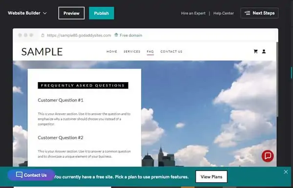
Recommended: This article will show you how to find the best fonts for your website using the GoDaddy website builder. Get started with a GoDaddy free trial.
Why Website Fonts Are Important
Fonts impart a lot of information about your website. The right font will have the trifecta: it’ll be stylish, readable, and support your brand identity. As one of the first things visitors will see on your website, the font can play a big role in whether they stay on the page or click off. The wrong font can be the difference between making a sale and losing a potential customer.
While it’s good to choose a font that reflects your personality and brand identity, it’s important not to get too cute or complicated. Choosing the wrong font can make your website look unprofessional and reflect poorly on your company. Additionally, an overly stylized font can make your text hard to read. Text color can also affect readability, so be sure to check out our How to Choose a Great Website Color Palette for more information on this.
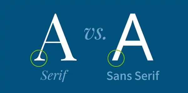
The Five Main Font Types
There are five main font types and each of these conveys a certain feeling. Like every element on your website, it’s important that your font type supports your site’s purpose. Serif fonts have a line at the end of a larger stroke, while sans-serif fonts do not. Both of these can be used for body text, and your preference will depend on your brand identity.
Script fonts are stylized to appear similar to cursive lettering, while display fonts are bolder and intended to be used for things like headers. Finally, modern fonts come in a variety of styles and are excellent for logos.
The main types of fonts and the feelings they convey are:
- Serif fonts: traditional and reliable
- Sans-serif fonts: modernism, strength, and style

- Script fonts: elegance, creativity, and a “personal touch”
- Display fonts: unique and varied, intended for use as headings.
- Modern fonts: strength, progressiveness, chic style
For more information on how to leverage fonts to create a stylish and effective website, read our How to Design a Successful Homepage article.
Website Font Mistakes to Avoid
Choosing the right font can help make your website look polished and professional. But, choosing the wrong font can make it look cutesy and unprofessional, as well as make the text difficult to read. This section will provide an overview of common font mistakes you should avoid.
Don’t Use Funny Fonts
Some fonts, like Comic Sans, should simply never be used. Some fonts like Papyrus were once popular but will now serve to make your website look silly and dated. You want your website to look professional and elegant and funny fonts will serve to make it seem childish and unprofessional, like this example:
Don’t Use Hard to Read Fonts
Readability is one of the most important elements of choosing a font. Your text communicates valuable information about your brand, goods, and services. If your visitors are unable to read this information easily, they will leave your site and go to a competitor that offers a more user-friendly experience. Here is an example of an illegible font:

Don’t Crowd Your Lines
Another way your font can be illegible is if your spacing is flawed. This can make your text difficult to read, as well as take up unnecessary space, not fill up enough space, or generally make your website look poorly designed and unprofessional. Below is an example of three different font spacings. The first is too narrow, the second is too wide, and the third is just right:
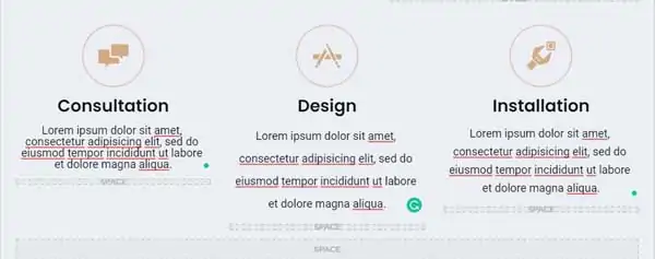
Don’t Use Too Many Font Designs
Using too many font designs for your website can make it appear cluttered, incohesive, and unprofessional. It’s best to stick to one or two fonts for your entire site — one for headings and subheadings, and another for content. Be sure to choose font pairings that complement one another and support legibility. Here is an example of too many font pairings:
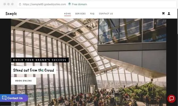
Don’t Use Too Many Font Colors
As with font pairings, it’s best to stick to one or two font colors throughout your website. You can use different font colors for your headers and content, and even occasionally use font color to underline a piece of text in your header. Here is an example of one way you can use color effectively for your website:

For more information on how to use color, read our How to Choose a Great Color Palette for Your Website article.
Don’t Use a Random Font Size
Be sure there is a rhyme and reason to your font sizes. Typical font sizes include 8, 16, 24, 32 48 and 64 pixel (px). 16 px is standard for most body text. Ensure that fonts are sized proportionally. You won’t want a header size that is too big for its corresponding subheader or body text, such as this example:

How to Choose a Font for Your Website
Here are some of the key factors to keep in mind before you choose a font for your website.
Begin With Your Branding
Your brand will have a major impact on your font choice. For instance, lawyers will want to keep their text clear, concise, and professional. People in this profession should avoid overly stylized looks as they will not appeal to their target audience. However, if your business is selling trendy clothes, you may wish to play around with a few modern styles to give your website a chicer look.
Consider what it is you’re trying to convey through your brand identity before making your decision.
Consider Your Target Audience
While your personal brand plays a big role in your font selection, you should also think about your target audience. Who is buying your products or services? What kind of styles do they find appealing? This can act as a roadmap to help you meet your clients’ needs. If your personal style conflicts with what your audience will engage with, it’s important to compromise or risk a negative impact on your sales conversions.
Keep Readability in Mind
The most important thing to achieve with text is to communicate information about your company. It doesn’t matter how “cool” a font looks if your potential clients are unable to read it. Be sure to choose fonts and font colors that are easy to read and don’t cause eye strain. This will maximize user experience (UX) and have a net positive impact on your website’s performance.
Test It Out
Be sure to play around with a font before you publish your website. What looks like the wrong font may actually be the wrong format. If your header isn’t standing out as much as you’d like, try making it bold. If your quote is looking a little undefined, try italicizing it and see if that helps. Don’t be afraid to experiment with as many different text styles as you do fonts to achieve the perfect look.
Use a Web-Safe Font
There’s nothing worse than finding the perfect font, adjusting the details, and going live with your site, only to find that your fonts are not displayed on mobile devices. It’s important to be sure to choose a web-safe font that will properly display on every device without any issues. For more information about finding a platform with the fonts that you need to effectively communicate your branding, read our Best Website Builder Review.
8 Best Fonts for Websites
In the following section, we will be using fonts provided by GoDaddy as visual examples. Use these as inspiration for your own font for your business webiste and branding.
#1 Font: Open Sans
Open Sans is a safe choice and universally effective. It can work with almost any business type. It is elegant, minimalist, modern, and is optimized for readability. This font is sure to have a positive impact on your website’s UX. Here is an example of a piece of text using Open Sans:

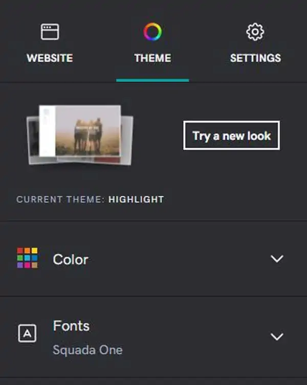
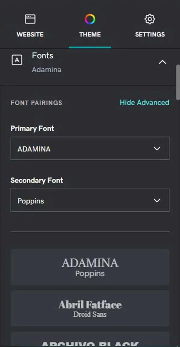
Below is a quick guide for how to change fonts in the GoDaddy site editor.
- To change fonts, select the Theme tab and open the options for Fonts.
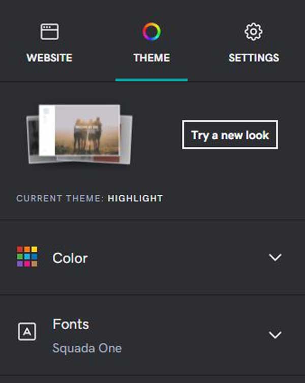
- The Primary Font is generally used for headings on your site. The Secondary Font is used for body text.
- Choose from recommended preset font pairings.
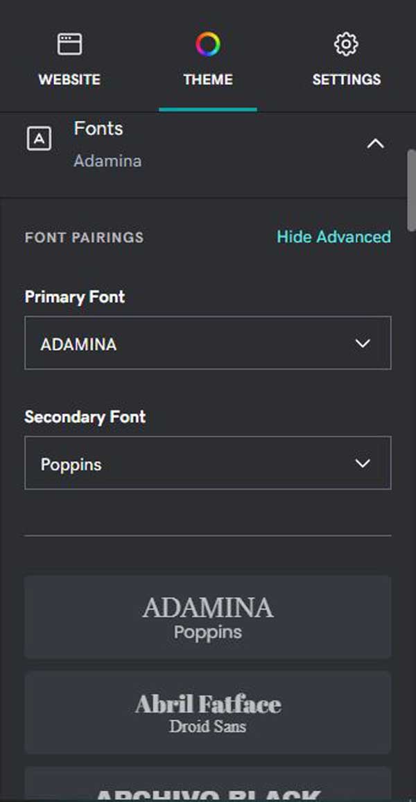
- If you want more customization, select Advanced to pick specific Primary and Secondary Fonts. GoDaddy will auto-suggest the best-paired font for readability, but you can change it to anything you’d like or select one of the preset font pairings again.
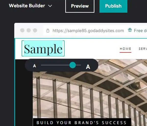
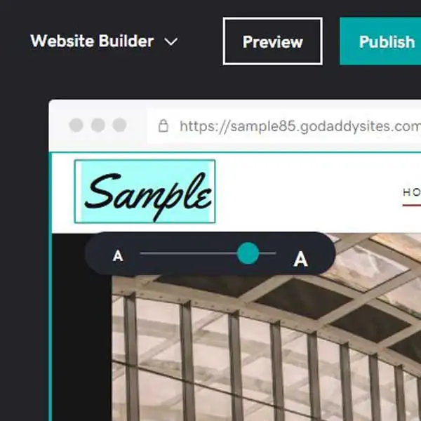
- To change the font size, select your website or the Website tab. Select the text field on your site that you want to edit. All text fields that allow editing will have an option to change the font size.
- Select the Font Size selector. This is shown directly on your site and is not available in the sidebar.
- Change the font size to be larger or smaller. If you are editing text in a layout that has multiple section groups, such as the “About Us” section, the text size will update so that all your text blocks in that section are a consistent size.

#2 Font: Montserrat
This font is a favorite among Millennials and Generation Z, and it’s a great choice if your target demographic includes teens and young adults. It is highly versatile and can be used for headers, subheaders, and body text. It scales well and is optimized for readability. Here is an example of a piece of text that uses Montserrat:
All GoDaddy fonts can be found under the Themes tab. Fonts are sorted alphabetically.
#3 Font: Roboto
This sans-serif font is both relaxed and professional. It is the default font used by services like Google and can be used for a variety of pieces of text. Its versatility is due to its readability and open curves. Here is an example of the Roboto font in GoDaddy:

#4 Font: Playfair Display
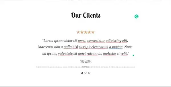
This serif font is delicate, feminine, and best used for things like headers. It is a favorite among wedding planners due to its popularity among women. This font is perfect for businesses whose target demographic is female. Here is an example of the Playfair Display font in GoDaddy:
#5 Font: Lato
This is a modern sans-serif font that was designed for corporations. It conveys friendliness, professionalism, and is ideal for companies in the financial sector, as well as law firms, or any industries that require a businesslike web design. It is also a favorite among information resource companies. Here is an example of the Lato font:
#6 Font: Merriweather
This font is popular among companies selling high-end goods and services. It conveys luxury through simplicity. It is well-known for its ability to render beautifully on a variety of devices, across a variety of font weights. Here is an example of a piece of text written in the Merriweather font on GoDaddy:

#7 Font: Helvetica
There are more than 100 varieties of Helvetica available, and it is widely considered one of the most versatile, readable fonts in existence. It can be used for a variety of text areas, including headers and body text, and the weight can be adjusted to serve your intended purpose. Here is an example of the Helvetica font:

#8 Font: Yellowtail
Yellowtail is a fun font that can be used for headers and logo areas but should never be used for body text due to readability challenges. It is a feminine font that is ideal for companies whose target demographic is female. Here is an example of the Yellowtail font in GoDaddy:
Moving Forward
Hopefully, this article provided you with useful information to help you choose the right font for your company website.
Still not sure which website builder is right for your business? Read our Best Website Builder Review for help finding a platform that works for you.
If you’re using GoDaddy to build your website, consider checking out our How to Make a GoDaddy Website and How to Use GoDaddy guides.
Get Started With GoDaddy
GoDaddy has all the professional fonts any business owner would need to have a successful and accessible website. Get started building your website today.