How to Choose a Great Website Color Palette in 2026
When it comes to designing your website, one of the most important aspects of design is the color palette you work with. Your color palette should be balanced, eye-catching, and promote your website’s purpose and brand awareness.
These days, using a website builder has become one of the best ways to create a professional site for your business. Luckily, most website builders come with the tools to be able to update, curate, and customize the color palette of your website. In this article, we will go over some of the key factors to consider when choosing a great color palette for your business.
Recommended: Make sure your website builder has everything you need to make your business site stand out. Refer to our Best Website Builder Review to learn more.

How to Choose a Great Color Palette
Color theory is both a large and niche subject. Not everyone who starts a business will have the same keen eye for the design side of things.
To learn more about color combinations and how they can impact your business, be sure to check out our Color Combination design guide.
Skip Ahead:
Why a Website Color Palette Is Important
If you’ve taken even the most basic art class, you probably have a general grasp of the color wheel and color theory. Most of us learn about primary colors, secondary colors, and tertiary colors at a very young age. One thing that isn’t taught in school is color psychology — the impact certain colors have on people’s moods and choices.
For this reason, color psychology also influences people’s choices and perceptions of your brand. While there is more science to color theory and psychology than we could go over in a single article, here is a general overview of some of the emotions associated with specific colors:
- Yellow: Happy, optimistic
- Green: Hope, peace
- Grey: Balance, harmony
- Black: Luxury, strength
- Blue: Trustworthiness, reliability
- Purple: Creativity, inclusiveness
- Red: Excitement, passion
- Orange: Cheerful, friendly
- Brown/Tan: Dependable, relatable
While basic color psychology is important to learn, choosing a color to express your brand is more complicated than basic emotions. It is good to also consider your core demographic or the group of people you want to sell/reach the most. This is because each individual’s reaction to color is tied to that person’s culture, gender, or life experiences.
How to Choose a Color Scheme
Choosing a color scheme for your business is dependent on what types of products or services you offer, as well as your personal taste and style. You should also choose a color scheme that will attract your desired customer. For instance, if you sell clothing, keep in mind that pinks, baby blues, and pastels will attract a more youthful audience. If you’re looking to attract mature women, opt for bolder solids like gold or black, or neutrals like beige or tan.
When choosing a website builder, it’s important to remember that not all platforms are equal when it comes to color selections. Some platforms offer strict color pairings, others allow you to mix and match as you choose. Some platforms also have much wider color palettes than others. Read our Best Website Builder Review for a comprehensive overview of some of your customization options with the best platforms in the industry.
Regardless of the color scheme you choose, ensure that it reflects your brand identity and personality, while also allowing the psychological effects of color to guide your decisions.
Choosing Your Primary Color
You may be familiar with the concept of primary colors from elementary school. When we talk about primary colors in web design, we’re referring to the main color that is used to represent your brand, in contrast to accent colors. This is one of the most important decisions you’ll make when developing your brand identity, so it’s important to choose your primary color wisely.
Here is an example of some primary colors and the businesses that use them:
- Yellow: McDonald’s uses this color because it has been psychologically shown to increase our appetites.
- Green: Starbucks’ uses green to promote a sense of freshness, growth, and safety for its customers.
- Blue: Blue is associated with loyalty, trust, and intelligence and is popular among manufacturers like Ford and Dell.
- Red: Coca-Cola uses its iconic, vibrant red color because of its association with excitement and happiness.
Here is an example of a sustainable clothing store that used a subtle primary color to support its brand and website’s purpose:
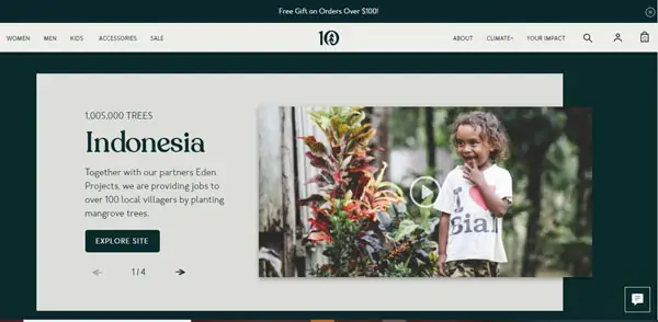
The dark-green color creates a sense of earthiness, but the color isn’t too bright that it distracts the visitors from the company’s offerings or bashes them over the head with its nature-centric theme. It’s balanced and subtle, but effective — qualities that should be your target when choosing a primary color for your business.
If you’re looking for more information on color schemes, read our How to Design a Successful Homepage article for more examples of great color design.
Additional Colors and Color Combinations
Now that you understand a little more about choosing a primary color for your website, it’s time to pick out some accent colors. You have a couple of options with your accent colors. You can choose subtle colors that support your primary color, or you can choose to incorporate a pop of bright color. This can be particularly effective with call-to-action (CTA) buttons, which should be noticeable and eye-catching.
Regardless of what you decide, be sure that the colors you choose are complementary and do not clash with one another. Complementary colors are colors that are located opposite one another on the color wheel. This helpful graphic can assist you in making your choice:
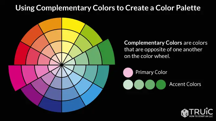
According to this graphic, if your primary color is pale pink, any shade of green will complement it beautifully.
How to Change the Background Color of a Website
The background color is a subtle — but critical — component of your website’s design. The right color can draw the user in and make the website feel easier to navigate, as well as convey a particular energy or emotion. However, the wrong background color can be distracting and convey a negative emotion. It can also make the website more difficult to navigate by impairing your site’s legibility.
This website made with GoDaddy uses a black background to bring its white text to the front of the page. This allows user attention to focus on the old-fashioned font, which supports the company’s brand as an antique dealer.

Some website builders make it more complicated than others, but here is a quick tutorial on how to change the background color of a GoDaddy website:
- In the GoDaddy site editor, select “theme”
- Expand the “Color” option
- Select from the suggested colors or use the color picking tool
- Use the “paint your site” slider to choose how light or dark your site will be
- Select “website” to return to the site editor
- Your changes are automatically saved and you can preview them
Learn more about GoDaddy and what it can do for your business website by reading our full GoDaddy Review, or get started with a GoDaddy free trial to test it out for yourself.
Choosing Your Typeface Color
Typeface color describes the color of the text used on your website. It’s important to balance this area for legibility as well as style. Soft grays create an inviting look for users, but it’s important to choose a background color that promotes readability for this color. If you choose black typeface on a white background, this supports your content’s legibility but can cause eye strain due to the high contrast.
Whichever typeface color you choose, finding a balance between style, branding, and readability is key. Your typeface color will also be affected by the font you choose for your website.
For more information on choosing a font, read our 8 Best Fonts for Websites in 2026 article.
Tips and Tools for Choosing Website Colors
Now that you have a better understanding of how to leverage color theory to benefit your website’s purpose and design, here are a couple of tips and resources that will help you ensure you’re making the best color choices for your website and brand.
Color Saturation
When choosing color saturation, you have a couple of options. You can use a variety of colors with the same saturation, or you can use the same color with a variety of saturations. This depends on which color you choose when deciding your accent color. Choosing a variety of colors in many saturations will make your website feel incohesive.
For instance, if you choose pastel pink and dark green, the green will have the effect of “washing out” the pink. Whereas a deep pink and forest green will complement one another beautifully. Pink is a lightly saturated red and can be used as an accent color for a website that uses red as its primary color.
Useful Resources
If you’re looking for more information on color pairings, our QR Code Generator includes an excellent tool that allows you to choose various gradient color combinations.
You can also read some of our website builder guides for more information on working with colors on a variety of platforms:
Moving Forward
Hopefully, this article provided you with a helpful overview of color theory and how you can leverage it to support your website’s purpose.
If you’re ready to get started creating a website, our Best Website Builder review can point you in the right direction and help you find the perfect website builder for your business.