Top 15 Famous Logos Throughout History
Knowing the history of logos and which ones have withstood the test of time can help you understand how to create one that will stick with your audience — potentially for centuries into the future. If you already have a concept for a logo, try our Free Logo Generator to see how it looks.
The History of Logos
You can see logos as far back as 1300 AD on the shop signs of Western European stores in the Medieval Ages. These were early versions, but the goal was still the same: the shop owner was trying to tell potential customers what they did. So a food vendor might draw a picture of a tomato in case customers couldn’t read the text of their shop name. Brewers during this period especially enjoyed the value of distinguishing themselves to customers. When you like one beer over another, you need an easy way to identify which brand is your brand.
The modern logo came into the picture around the early 1900s and continued its evolution as mass printing became more common. Modern logos came on the heels of color printing in the mid-1800s, something that allowed brands to produce the kind of colorful posters and labels that have become so ubiquitous today.
During this time, the economy was booming. More people than ever before had extra money to spend, meaning businesses had a new audience to market to. For instance, as early as 1885, everyday people came across the Coca-Cola logo on corner stores and markets.
By the mid-1950s, companies were starting to create logos that conveyed more than just its name. Most famously, IBM came out with a drawing of an eye and a bee instead of the letters I and B. It marked a shift in how we think about logos and what they mean to us. It’s the creativity that draws us in the IBM example. You might look at the design at first and think of a totem pole or a hieroglyphic. But if you stare for just a second longer, you’re in on the joke.
The Power of Symbols
Logos might be a relatively modern concept, but its cousin the symbol has been used for thousands of years. Long before people could write down what they thought, they relied on these images to send messages to one another. From religion to politics, we can see all kinds of art containing images that convey a deeper meaning to the viewer. Even after they could form sentences, symbols served as a way to talk to people on another level.
An important part of a logo is a memorable business name. We can help you find the perfect business name using our Business Name Generator.
Top 15 Famous Logos
We’ll look at 15 brands that have managed to take this concept and really cement it in the hearts and minds of their customers.
1. Walmart
This brand has gone through a few iterations of its logo, but the basic design has remained similar. The blue may have been made a little lighter, but the iconic color is still heavily associated with the Fortune 500 company. Walmart took out the star in the middle of its name in 2008 and added a sun to make it a little friendlier to the customer. The spark at the end of the name is a good use of negative space, as our mind fills in the blanks of the white in the middle.
2. Pepsi
The bright colors of Pepsi are a little American tribute disguised in a corporate jacket. These red, white, and blue areas are arranged in a way that’s easily recognizable. Today’s Pepsi logo has been updated to a more modern interpretation. It’s a little more fluid, which is fitting for a soda company. At its heart, it’s nothing more than a circle and a couple of dividing lines, but taken together it’s more than that.
3. Baskin Robbins
The iconic ice cream brand relies on a fun and playful monogram to tell you that you’re in store for 31 flavors. This is an excellent use of typography and color, as you can see the famous number if you look at the pink in the B and the R. In most cases, Baskin Robbins will print its name below the blue and pink circle of the logo, making it a good illustration of how repetition can be used to really reinforce your message.
4. Toyota
This brand uses curved edges and a metallic color as a way to represent that the brand’s products are something to be trusted. It might not be the most daring car on the market but that doesn’t mean it isn’t valuable. The logo is meant to overlap the heart of the company with the heart of the customer and results in a very loopy T (or a couple of steering wheels) to represent its mission.
5. LG
This brand is not just recognized in America, but everywhere. The monogram is well illustrated in the design, but the letters also serve to create a face where the L is the nose and the lip of the G creates the mouth. This was chosen as the logo because LG is a brand that cares about the people both behind the products and the people who use its products.
6. Shell
The gas company has had the same base logo for more than 120 years, even if it’s been redesigned a few times. Today, the symbol is so recognizable that the company got rid of the word Shell before the clock struck 2000. Every iteration of the logo, including the version that used the now-famous bright yellow and red, was intended to make the actual shell design more abstract than the original.
7. Starbucks
This coffee company has always had some version of the famous mermaid, even if it did become a much better drawing after Starbucks hit it big. The original version was a naked mermaid dividing her tail in two and holding each side up with her hands. You could look at that first logo as a good use of the rough drawing technique, but ultimately marketers decide they needed more to take the whole thing mainstream.
8. Target
This company is a great example of a logo that gets to the point quickly. The bulls-eye target is really all you need to know what you’re getting into. Target used to run its name under the actual symbol but dropped that technique years ago. Now just seeing the trademark is enough to point you in the right direction.
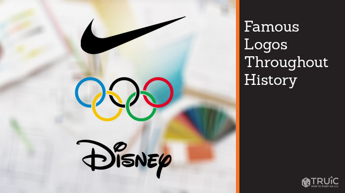
9. Disney
Handwriting used to be a central component of who we are, a fact that has gone the way of the dodo the more we see technology come into play. But the vast conglomerate that is Disney still relies on the signature of its famous founder in pure black. It’s probably one of the better examples of how you can use typography and simplicity to make your logo stand out.
10. GAP
GAP has pretty much always kept things simple. Much like their clothes, GAP tried to convey timeless sophistication and a classic style to its customers. In the 1960s, it was ‘the gap’ in simple lower-case letters and later changed to the blue box and white letters of GAP that we’re so used to seeing today.
11. Tostitos
This brand is all about parties, so why not draw a couple of people standing over a salsa bowl? The two middle Ts in the logo are the people and the red dot of the I is the famous dip. This graphic logo does a great job of telling you that the product is perfect for a fun time and meant for hanging out together.
12. Nike
What does a swoosh of a basketball net look like? Well, it looks a lot like the logo of Nike. Much like many of our other examples, you no longer do you even need the letters to identify the brand. Nike borrows its logo from the wings of the Greek goddess Nike, and it also has a bit of a double meaning in that it could look like a checkmark too.
13. The Olympics
This might not be a brand in the traditional sense, but the logo is one that perfectly represents the nations coming together. The interlocking circles and colors are based on the continents that come to the everlasting flame. It’s simple yet powerful enough to be understood the whole world over.
14. UPS
The brown of the logo is synonymous with the brown of the trucks, packages, and driver uniforms. The colors and text encased in a shield are a good way to connote reliability and efficient movement. It’s also an excellent example of a good monogram.
15. Apple
If the first bite of the apple is always the best, then this company really managed to profit off that concept. It’s a beautiful use of silhouette design, one that needs no introduction. No matter what color you print the image in — metallic, black, or white — Apple is always giving its audience a clean intro.
What to Take Away
There are plenty of qualities that successful logos share, and understanding those qualities can give you some great ideas as to where to take your design. There’s no need to push the envelope here or create complicated images when a simple one will do.
If you need help with desiging a logo for your brand, check out our top 5 best logo makers of 2021 and find the best tool to help you get a logo for your small business.