History of the FedEx Logo
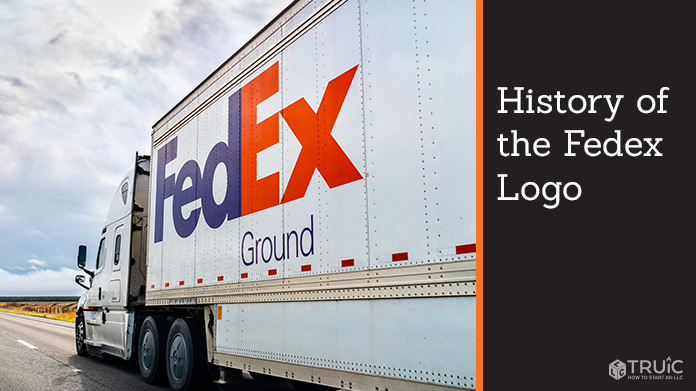
FedEx®, one of the most reputable and influential shipping businesses, has only had two logo renditions — one created in 1971 and one in 1994. Both have interesting backstories and mysterious origins, with the last version being hailed as one of the most ingenious logos of all time, winning multiple awards and accolades.
FedEx understands that logos are the face of a business. So if you are creating a startup or re-branding your company, the logo you design has to be bold and memorable. With excellent tools like our free logo generator at your disposal, you can develop something that will catch potential customers’ eyes, just like the FedEx logo.

Two Different Logos
Unusually, FedEx has only gone through two logo versions in its history, when many global corporations go through several edits before settling on a final design. The first logo was created in 1971 and displayed the shipping company’s full name – Federal Express – in white and red on a blue and white background.
The second and current FedEx logo, designed by world-renowned logo designer Lindon Leader, doesn’t use the company’s full name but shortens it to FedEx, which is what most customers call the company currently.
Although the company had grown into a global giant by the time the logo was redesigned by Leader in 1994, it was the crafty detailing of the logo that drew the public’s attention.
The Hidden Arrow
Leader designed the FedEx logo with a capital “F” for the first letter and capitalized the second “E.” In between the last two letters, the “E” and the “X,” the negative space creates an arrow pointing to the right to connote speed and precision — two strong qualities you want in a shipping company.
Furthermore, the Arabic FedEx logo has the same feature, an arrow made from negative space, but this arrow moves from right to left because Arabic is read from right to left.
Color Changes to the FedEx Logos
The original red, white and blue colors signified reliability and patriotism. Federal Express’ name and color choices reflected that the company hired locally both from the private and public sectors.
The later logo sported purple, which added a sense of power. The original FedEx logo was high-contrast orange and purple, with purple lettering for “Fed” and orange for “Ex.”
With this color scheme, the company added an ingenious branding tactic. As FedEx grew, they created other company arms such as Freight, Trade Networks, and Ground. Depending on which of these departments the shipment is using, FedEx swaps the color it uses for the “Ex” in its logo.
For example, FedEx Express is the classic purple and orange, FedEx Office is purple and bright blue, and FedEx Ground is purple and green. It’s an innovative way to differentiate between different departments without compromising the integrity of your overall brand image.
The Power of a Great Logo
The power of branding cannot be understated; the design of a company logo can make or break a business’s future. Once FedEx doubled-down in 1994 to retool its branding, its new, smart logo made the company an easily identifiable entity. Similar to KleenexⓇ and Band-AidⓇ, FedEx has become a household term to describe any kind of shipping.
Like all the best logos, Lindon Leader’s decision to use shortened text and a subtle arrow symbol was brilliant and simple. It is exceptionally memorable, which is one of the top qualities your company’s logo should have.
Make an Impact With Your Company Logo
With the free TRUiC Logo Maker, you can generate thousands of logos in just a few seconds — even without any previous design experience. Simply answer a few design questions and get a variety of options to choose from.
Use classic brands like FedEx to guide you through your logo-making process. If you keep your design uncomplicated, clean, and subtle, you can create a brand for your company that consumers can easily remember for years to come.

