History of the TikTok Logo
One of the strongest elements of a company’s brand identity is its logo. Without a clean, identifiable, and relatable logo, it’s all too easy for your business to get lost in the competition. Using tools like our free logo generator can help you design a one-of-a-kind logo that supports your branding, but sometimes it also helps to look to successful brands for inspiration.
For inspiration on successful logo design, look no further than TikTok®, the wildly popular video-sharing and social networking platform your kids, friends, favorite celebrities, and more are using to create and share short-form videos. This video service has taken the world of social media by storm, and it boasts an equally impressive logo.
To fully understand what goes into logo design and find some inspiration for your own business’ logo, let’s take a deep dive into the history of the TikTok logo.

Inspiration Behind the TikTok Logo
Great company logos are often born out of winning business ideas. In 2016, Chinese tech giant ByteDance released a service called Douyin that enabled users to create short 15-second videos. The company quickly rocketed to 100 million users and became available internationally under the name TikTok.
When TikTok was formed, it was a merger between ByteDance and lip-sync app Musical.ly. Prior to ByteDance’s acquisition of Musical.ly, these two platforms existed separately within the US and foreign markets. Once TikTok acquired its official name, all Musical.ly accounts were transferred to the brand, which explains the app’s initially strong musical focus.
TikTok Logo Design
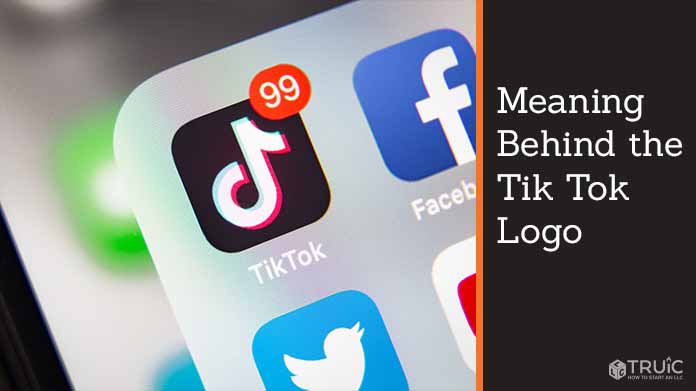
As a relatively young brand, TikTok has largely maintained its original logo design thus far. Though users use this platform to create short videos surrounding comedy, challenges, dances, and education in addition to music, the logo uses a colorful music note that represents its melodic beginnings.
Some of the most popular videos used on the platform include users performing dance challenges, duets, and lip-syncs. Because the service is focused on enabling anyone to be a content creator and produce lively, entertaining videos, the logo’s musical note was thoughtfully designed to appear as though it moves. This movement is harmonious with the dynamic movement found in the videos that people create and share on TikTok.
One small change made to the design in 2017 was the addition of the company’s name. What used to be a simple neon, 3D music note then included the company name. However, at that time, the company had branded itself as “Tik Tok” — two words. Then, in 2018, the brand decided to merge the name into one word, which is now displayed as “TikTok” in the logo.
As the video service and social media platform continues to grow and evolve, its logo may see several more iterations to match its innovative branding. Like many brands, to stay relevant, it’s often essential to make strategic updates to logo designs that help the brand continue to thrive.
TikTok Logo Color Palette
The colors of the TikTok logo are very intentional to help bring the musical note to life. Influenced by a rock concert, the brand’s designer purposely used a somewhat traditional black music note with overlapping pink and blue colors in the same shape to create a neon-looking musical note.
Thanks to the overlapping neon notes, the logo appears to be vibrating when you look at it, lending it a unique sense of motion that you don’t find in other logos. This vibrant, 3D note is instantly recognizable and helps set the logo apart from other logos that use this common musical symbol.
Design a Strong Logo With TRUiC
At TRUiC, we know a thing or two about forming a business, designing logos, generating business names, and more. To help your business be successful, check out our business resources to help get your business up and running.

