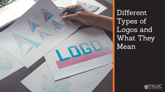
Top 7 Different Types of Logos and What They Mean
The most basic structure of a logo is text, pictures, or some combination of both. However, there are different categories depending on how you use your typography and images. We’ll look at the major types and what they say about the company it represents. If you’re ready to get started on designing your logo, use our Free Logo Generator.
The Different Types of Logos
While you may not be able to classify every type of logo, you know that companies can take very different approaches to the same branding problem. But having some context behind what makes logos different from one another can give you a better sense of the marketing strategy you want to use to distinguish your company.
1. Wordmarks
A wordmark,sometimes known as logotypes, is a logo that only uses text for it’s design and commonly uses just the name of a business. This logo is created to emphasize the brand name, and it’s worked well with all kinds of companies. From the financial services sector (e.g., Visa) to tech (e.g., Google), not every business sees the need to adorn their logos with a pictorial.
They rely on the strength of their brand to spell it out in just one or two words. Some brands might shorten their name to make it easier to digest. For example, a sweatshirt that says Yale instead of Yale University.
If you’re selecting this option, you’re encouraged to be bolder when it comes to typography. Feel free to embellish wherever you need to. Google goes so far as to have animated logos that spin around on a web page, which definitely adds some dimension to their brand.
2. Pictorial Mark
Pictorial marks are logos that use a clear and easily recognizable symbol or graphic that can be shown with or without the name of the business. You don’t have to see the words Apple, Twitter, or Target next to any of their company logos because these businesses have done such an effective job creating an easily recognizable pictorial mark. Experts will tell you that this is definitely a risky move for most new startups, simply because you don’t have brand recognition yet.
However, effective pictorial marks can gain recognition very quickly if marketed in the right way. For example, Fyre Festival, a concert event to be held on an island, used nothing but an orange square to signify fire on social media. It turned out to be an extremely smart way to build anticipation and audience awareness. Although the event itself could not have gone worse, the actual marketing was ingenious.
3. Monogram Logos
Monogram logos are even simpler than wordmarks. Instead of spelling out the name of the company, it abbreviates it to just a few letters. So instead of the National Aeronautics and Space Administration, you end up with NASA. If you don’t expect your audience to have to read four or five words of your company name, you might want to cut it down to just a monogram.
There’s also nothing wrong with taking the monogram a little further either. So even if your company name is just one word, you could feature the starting letter in all its glory. As with wordmarks, your font makes all the difference. Make sure that you’re choosing a typeface that represents your company and that it’s easy enough to read for the average person.
If you want to give people a little more, put your full company name below the monogram until your customers and vendors are familiar enough not to need the reminder. When they spread the word about your company, they can fill people in on what the monogram stands for.
4. Combination Marks
The combination mark will use both a picture and text together. You might see these two things near each other, as with the Lacoste text directly underneath the alligator image. But you’re more likely to see the text integrated with the picture, as with the logos for brands like Burger King or Doritos.
Combination marks are a popular choice because you’re both identifying the company name and giving people a memorable image to take with them. There is also nothing to say that you can’t eventually transition from a combination to a pictorial only once you build up recognition. Just keep in mind that it would make for a more involved redesign if you had already integrated the text and images.
5. Abstract Marks
Abstract marks are a kind of pictorial logo that is a little more nuanced than the standard icon pictures we’re used to today. It’s essentially anything that you might have to interpret once you look at it. The Adidas logo is famous for using abstract marks, both with its flower and mountain. On the face of it, the Adidas logo might look like a simple stenciling job. But the imagery has its own meaning for the company, one that its audience has quickly come to associate with the company’s products.
Abstract marks are a creative way to speak to your customers, especially if you want to inspire some degree of emotion with your brand. They’re also great if you want to avoid potential legal disputes (in the case of using a traditional picture) or find new ways to express yourself in a crowded industry.
6. Mascots
From Ronald McDonald to Colonel Sanders to Mr. Moneybags, pictorial marks or combination images can come in the literal face of a mascot. Generally reserved for brands geared toward children or those that cater to families, the point of a mascot is to make the personality a recognizable character to relate to.
Mr. Peanut might not be a person, but he’s a monocled cartoon character that makes the snack a little more fun. It also serves to distinguish a plentiful crop from its less memorable suppliers. You want your mascot to stand for the same values that the brand stands for. While the gecko of Geico fame was originally seen talking about how he didn’t want to be associated with insurance, he went on to become a funny, sophisticated character. As more commercials debuted, the lizard’s role was to inform people about how the company could help them stay safe on the road.
7. Emblem Logo
This is another type of pictorial mark, one that is viewed as more official. (If you have a family crest, that could be viewed as a type of emblem logo.) Schools, government agencies, and nonprofits might adopt a seal or badge or create one from scratch. They can be used to add some degree of authority to a business, but you also need to be careful with it.
If you use an emblem logo but don’t have any gravity behind it, people may come to view it as a joke. (Of course, you could always use that as leverage if you wanted to use humor in your logo.) One of the most modern versions of the emblem logo can be seen in the Starbucks mermaid. Her image is never used as a vocal ambassador of the brand, meaning she’s not a mascot. She’s merely a symbol that has now come to be associated with an international juggernaut.
The Rules of Repetition
True logo recognition doesn’t happen after just one glance. Some companies have more of a chance of sticking, but all companies will have to have some degree of consistency before starting to develop the kind of brand that will go the distance. As you long as you’re putting effort behind your marketing and message, you should see the right kind of response.
Tips for Using Logos
Experts recommend using wordmarks if your company name is relatively short and easy to connect with what you do. This type of logo is easy to move from print to wearables to digital, so you don’t have to worry as much about whether the nose of your mascot will scale the way you want it to. The only caveat here is to remember that you’re likely starting with no company name recognition.
If you’re choosing a pictorial mark, remember that things quickly change for businesses as they grow alongside their target demographic. Maybe you start off selling homemade earrings, but quickly find that there’s more of a demand for necklaces than earrings. If your picture is of an earring, you’re going to have to find something else to represent your company. If you’re planning to choose an abstract mark, you might want to have a professional design it.