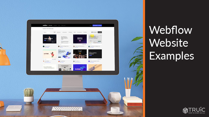
Webflow Website Examples For Small Businesses
A website represents the most crucial part of a business’s online presence. Fortunately, tools like the Webflow website builder can simplify the entire web design process.
The Webflow editor requires absolutely no coding experience and makes it easy to create a stunning website. But what will a website designed with Webflow look like? Here are the 12 best Webflow websites of 2026 to help inspire you to create your own.
Learn what you’ll need to build the best website for your business by reading our How to Make a Website guide.
12 Best Webflow Website Examples For Small Businesses
Webflow is known for being incredibly user-friendly and great for web building beginners. If you’re ready to create your own Webflow website, use this article for insights and inspiration for making your business site even more dynamic.
Check out these useful articles to see if the Webflow website builder is right for you:
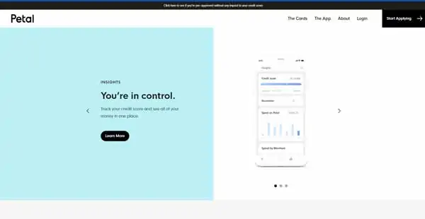
1. Petal (Credit Card Provider)
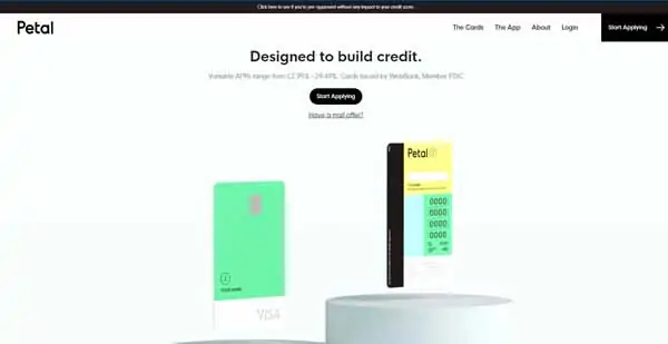
The Petal website makes excellent use of animation effects. Under a fixed navigation bar and surrounded by plenty of white space, for example, two credit cards on its homepage rotate as site visitors scroll up or down.
When visitors hover over the first item in the navigation bar — “The Cards” — a drop-down menu opens. Hovering over the other navigation items makes them fade from black to gray — a visual effect that continues across all buttons and links on the site.
The company’s creative use of animation continues further down its homepage with a three-photo slider that features a phone screen demonstrating the Petal app’s functionality.
The Petal homepage also includes some carefully chosen photos and pull quotes from well-known publications presented in clean, simple blocks alongside whimsical, cartoon-style drawings.
The plentiful white space, eye-catching animation, and playful, black-and-white art combine to create an attractive, professional website that customers will find easy to navigate.
2. AngelList Venture (Investment Website)
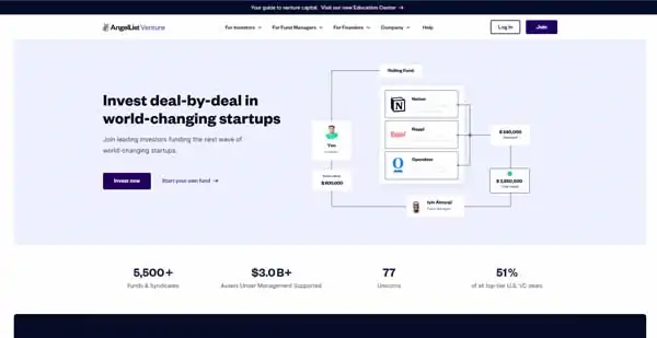
The AngelList Venture investment website stands out for its creative use of flowcharts, which use animation to populate various sections as visitors watch. This adds eye-catching movement to the site’s minimalist layout.
A fixed navigation bar offers four drop-down menus for various website sections plus a “Help” link and buttons to “Log In” or “Join.”
Under the animated flowchart at the top of the site’s homepage, a dark-colored block features a slider of investor profiles. Beneath that, another slider showcases glowing reviews of the company posted on Twitter.
Below that, you’ll find a box that features another series of animated flowcharts followed by an attractive photo with text that invites visitors to click on a “Learn More” or “Join Us” button.
Using only the Webflow website builder, AngelList Venture’s website deftly incorporates multiple elements without seeming overly busy. This makes their Webflow website both inviting and simple to use.
Make sure your website has everything it needs to be just as effective with our What Makes a Good Website guide.
3. Lattice (Human Resources Software Company)
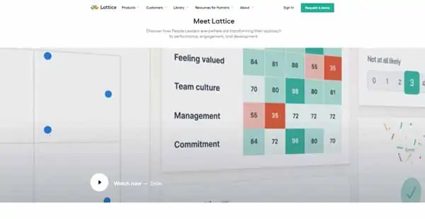
Human resources company Lattice provides another example of a site that makes excellent use of the Webflow website builder’s highly customizable elements.
Along with multiple drop-down menus in its fixed navigation bar, Lattice’s homepage features photos of varying sizes and a video that stretches across the width of the page to create visual appeal. Certain sections also use parallax scrolling — an effect in which the foreground and background scroll at different speeds to create the illusion of depth — to engage visitors.
Some blocks fade into existence as visitors scroll up and down the homepage. Further down, a series of colorful blocks contain icons that bounce or pulse in a playful animation when scrolled over.
A solid white background supports all of this visual diversity to further highlight the appeal of these website elements.
4. HelloSign (eSignature Software Company)
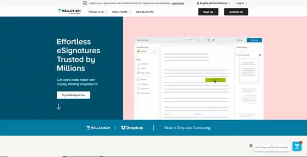
The HelloSign website uses several attention-grabbing elements to make its straightforward homepage stand out. Under a fixed navigation bar with two drop-down menus plus “Sign Up” and “Contact Us” buttons, an animated graphic shows a computer cursor dragging and dropping items onto a legal document.
Next comes a pricing block, which transforms when users click on the “eSignature” or “API” buttons to present an itemized list of the features included in various pricing tiers.
HelloSign’s Webflow website also features a “Frequently Asked Questions” section and a “Recommended Reading” list round out the information offered to potential customers in this simple, yet visually rich layout.
Upon opening this website, visitors encounter an unobtrusive “Can I help you find something?” button in the bottom right-hand corner. Clicking on this button opens a chat window, which visitors can use to help them find the information they seek on the site.
5. Getaround (Ride-Sharing Service)
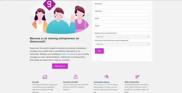
Ride-sharing company Getaround boasts a website that makes it easy for visitors to sign in or sign up. Its primarily white homepage features splashes of the company’s signature shade of fuschia on buttons, icons, banners, and its logo.
Below the homepage’s unfixed navigation bar, which features six drop-down menus, a simple block explains what the company offers. This block includes three buttons to “Continue with Facebook,” “Continue with Google,” or “Continue with Apple” alongside an image of a smartphone, featuring the Getaround app in action.
The next section features a graphic of three smiling people, a “Share your car” button, and a form. (Many businesses use online forms to collect information about potential customers and direct them to the products and services they seek.) Below the form, a series of blocks headed by fushia-colored icons extols the benefits of signing up with Getaround.
The next block features a graphic of a man driving and a “Book a car” button. Below that, a slider highlights three customer testimonials with accompanying graphics. Near the bottom of its homepage, this site also provides a section that invites visitors to join Getaround’s host community and a banner with “See cars in Europe” and “See cars in the US” buttons.
Smart use of forms and buttons makes it easy for visitors to find what they seek on Getaround’s Webflow website.
6. Prepped (Meal-Delivery Service Blog)
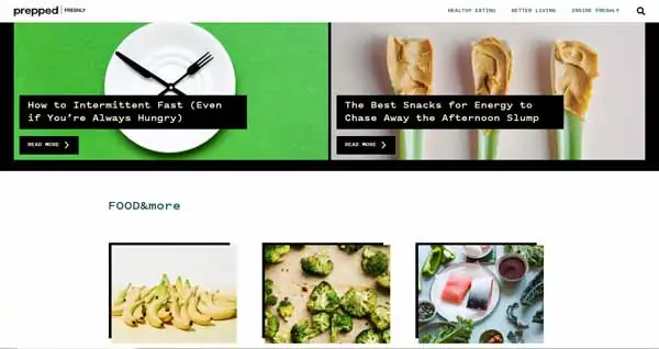
Prepped, the blog created by meal-delivery service Freshly, uses their Webflow website to display mouth-watering photos of food to maximum effect.
Under a fixed header with three items — “Healthy Eating,” “Better Living,” and “Inside Freshly” — it features a screen-wide photo attached to a recent blog post followed by a series of photo blocks linking to other posts.
While the site does have a few text-only links, it mainly features links embedded within gorgeous photos of food items in various stages of preparation. Most of the text on the site resembles embossed labels: white letters on a black background. Hovering over the navigation bar items also transforms them from a black-on-white to a white-on-black design.
A simple, attractive banner near the bottom of this blog’s homepage invites visitors to click on a “Check Us Out” button. That button leads to the Freshly website where viewers can sign up for Freshly’s meal-delivery services.
7. Attentive (Mobile Marketing Firm)
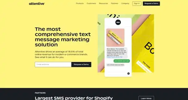
The Attentive website uses color and simple animation to catch visitors’ attention. Each section features a different pastel background shade, for example, while charts and text conversations unfold before visitors’ eyes.
The fixed navigation bar appears in the same pastel yellow as the first section until visitors begin to scroll down the homepage. Then, it turns white.
Under a block of text beside an animated text conversation, a single-item form allows visitors to enter an email address and click on a “Request a Demo” button.
Further down the homepage, a grid of blocks — each featuring a different pastel color — invites visitors to learn more about the benefits Attentive provides.
The next few sections offer a coupon, more animated text conversations and charts, a slider of attractive images and testimonials from well-known companies that use Attentive, and a grid of images linked to blog posts that move slightly when visitors hover over them.
The final section returns to the yellow shade of the first section and offers another chance for visitors to request a demo.
8. SunWest Credit Union (Bank)
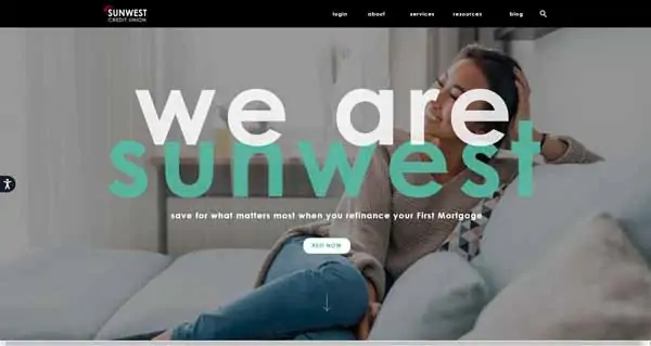
The homepage of SunWest Credit Union’s website makes excellent use of special effects on photos and other elements. For example, the white font used for items in its black, unfixed navigation bar turns red when visitors hover over them. The full-screen photo at the top also slowly zooms in.
The next section features auto loan, certificate of deposit, and money market rates that rapidly scroll from zero to the current rates as visitors watch.
Scrolling down, visitors reach a customer service-focused section with icons for “locations,” “promotions,” “get in touch,” and “digital banking.” These four icons remain static until a visitor hovers over them, at which point they wiggle as the relevant text label appears beneath the icon.
The next section features text and several buttons that enlarge and change color when visitors hover over them. It also includes a cutout area that reveals a photo of the bank’s employees engaging in a volunteer activity.
The final “stay in touch” section uses a three-column layout. The “get social” column features a photo slider and social media buttons for the bank’s Facebook, Instagram, Twitter, and YouTube accounts. The “see you there” column includes a static image and a “see what’s new” button. The “sign up” column provides a short form, requesting potential customers’ first name, last name, and email address.
9. MURAL (Digital Workspace)
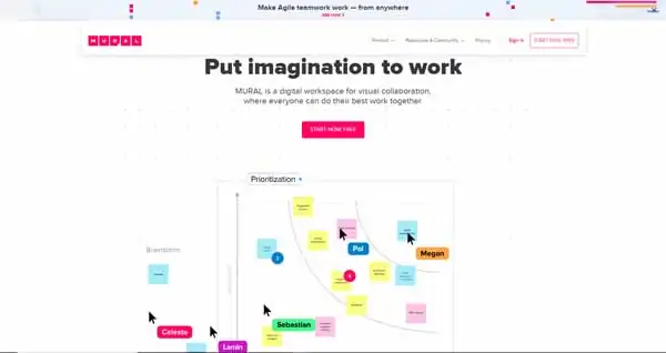
The Mural website also makes impressive use of animation to engage visitors. Under a simple, fixed header, the first section of its homepage features a constant-motion image of collaborators moving items around on a whiteboard. This section’s background is a grid of multi-colored dots.
The next section includes a grid of three blocks that feature “See It Now,” “Join the Waitlist,” and “Explore the Template” buttons. The buttons appear white with pink text, but reverse those colors when visitors hover over them.
An “In good company” section showcases the logos of well-known businesses that use MURAL’s services. It also includes a slider of customer testimonials — each topped with the name, title, and headshot of the speaker.
The “More than a whiteboard” section features another animated image, depicting various team members working on a variety of project types.
10. Rakuten Super Logistics (Ecommerce Fulfillment Company)

Rakuten Super Logistics uses screen-wide images and strategically placed buttons to create an attractive, easy-to-navigate website.
This Webflow website makes it easy for site visitors to get a quote, with red “Request a Quote” buttons in the fixed header, the first section, and the last section before the footer. Additional buttons invite visitors to “View All” and/or “Learn More” in every section.
Most buttons on this site’s homepage have white lettering on a black background that turns red when visitors hover over them. But, some buttons feature a red background with white lettering and either reverse their colors or change to a transparent background when activated.
A U.S. map outlined in red highlights Rakuten’s fulfillment center locations while a grid of blocks identifies the key shipping carriers it uses. Each shipping carrier block shrinks slightly when visitors scroll over them.
In the “What Our Clients Say” section, a few simple blocks showcase testimonials with small photos overlapping their upper-left corners.
Below the footer, a banner touts Rakuten’s partnership with FC Barcelona alongside a compelling, ad-style photo of several team players.
11. Heco (Design Studio)
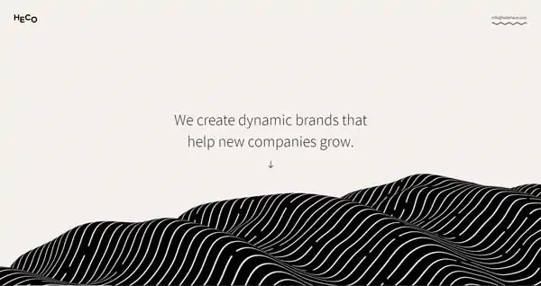
Unexpectedly, Heco design studio boasts a stunning website filled with breathtaking animation and cleverly executed elements.
The fixed header on this gorgeous website is simple, yet eye-catching. The company’s logo in the upper-left corner turns into an animation when visitors scroll over it while the same action makes the wavy line under the its email address in the upper-right corner start flowing. This flowing effect continues for every linked word or phrase throughout the site.
Under the initial image of a black-and-white roll of waves that constantly undulates, visitors reach a black background with white text that explains the services Heco provides. A grid of attractive photos appears next on a white background to highlight some of its clients.
Below this grid, a blue background fades in with a partial headshot of each of the studio’s founders to the right and left of the screen. A block of text provides a short bio of JT, one of the company’s founders. As visitors continue scrolling down the homepage, this text block fades into another that shares a bio of Matt Cowen — the company’s other founder.

Next, a slider of magazine-quality photos rotates slowly as site visitors scroll downward.
Each section of this Webflow website fades into existence with a different background color as site visitors scroll through the page. This creates an impressive, eye-catching effect.
12. Brink Election Guide (Nonprofit Voting App Provider)
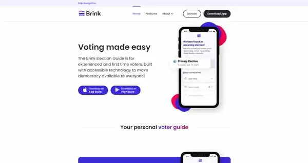
The minimalist website for the Brink Election Guide app makes excellent use of color and white space. A fixed header provides links to the site’s “Home,” “Features,” and “About” sections as well as “Donate” and “Download App” buttons.
The first section explains the purpose of the app and offers buttons to download it on the Apple App Store or the Google Play store. This section also includes an image of a smartphone, using the app, surrounded by blobs of blue and red.
Several lines of text also fade from blue to red throughout the site, referencing the colors associated with the two major parties in the U.S. political system — red for Republicans and blue for Democrats.
Other sections on this site’s homepage highlight different aspects of the app with more images of smartphones and multiple “Download app” buttons.
This Webflow website also features a block of logos, highlighting the nonprofit’s partner organizations and a testimonial from U.S. Senator Tammy Duckworth.
The simplicity of the Brink Election Guide website makes its use of color and images really stand out. This design approach helps draw attention to not only the information provided in each section, but also the plentiful download buttons that make it easy for visitors to access the app.
Make sure your website has everything it needs, check out our What Makes a Good Website guide.
Final Thoughts
Hopefully, these examples demonstrate how other businesses used the Webflow website builder to create innovative, beautiful websites. Webflow websites can employ a combination of colors, animation, and other visual elements to successfully attract and engage visitors.
When you’re ready to create a Webflow website for your business, check out these useful articles:
Ready to get started with Webflow?
Begin building your professional business website with Webflow. Click the button below to get started for free.