Examples of Wix Websites For Small Business
The Wix website builder is one of the most innovative and popular platforms out there. Wix is a great tool for web design beginners due to its sleek design and ease of use.
But can you make a professional site that really wows? For inspiration, check out these 12 best Wix website examples.
Learn what you’ll need to build the best website for your business by reading our How to Make a Website guide. And be sure to check out our Best Website Builder for 2026 to find the right builder for you.
12 Best Examples of Beautiful Wix Websites
Wix is known for being incredibly intuitive and great for beginners just getting started building their business website.
If you’re ready to create your Wix website, check out this step-by-step guide to building your site and this how-to guide for insights on making your Wix site even more beautiful.
Ready to create a Wix website for your small business? Get started for free by clicking the button below.
Kate Flora Photography (Professional Photographer)
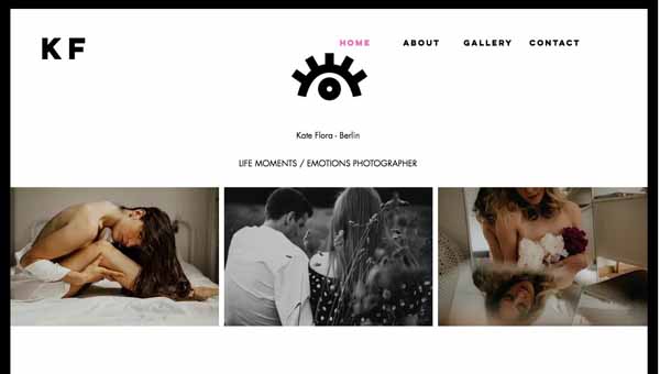
Visuals-based businesses require a clean, attractive online presence to complement the beauty of their work. Kate Flora Photography achieves this with her elegantly designed Kate Flora Photography website, which pairs a fixed navigation menu in the homepage header with an animated, blinking eye logo.
Each button in the navigation menu turns pink when visitors hover over them. From here, visitors can access an “About” page that provides more information about Ms. Tomylina, a photo gallery divided into seven sections by a drop-down menu, and a “Contact” page.
The bulk of the homepage features a grid of photos without text, allowing the work to speak for itself.

Below this stunning collection of photos, a simple footer includes social media icons that link to this photographer’s Instagram and Facebook accounts.
Want to improve your portfolio’s search engine ranking? Check out our Search Engine Optimization (SEO 101) article to learn how to build an SEO-friendly website.
Donna’s Running Club (Fitness Trainer)
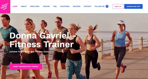
Businesses that offer services, such as fitness training or yoga, need websites that make it easy for customers to find pricing information and schedule a session. The homepage header on the Donna’s Running Club site features a navigation menu that prominently displays options for booking sessions, reviewing pricing, finding locations, and contacting the business. It also includes a Facebook icon and buttons to sign up and to download the Donna’s Running Club app.
The rest of the homepage uses parallax scrolling — an effect in which the foreground and background scroll at different speeds to create the illusion of depth. The website pairs this effect with simple photo grids that have alternating white and pink backgrounds for a clean, yet eye-catching appearance.
This website also features pull quotes and an expandable map that highlights each Donna’s Running Club location. The footer includes a “Contact Us” form, an invitation to follow the club on Facebook, and buttons for downloading the club’s app from the Google Play store or the Apple App Store.
ilaria Bonardi Jewels (Jewelry Retailer)
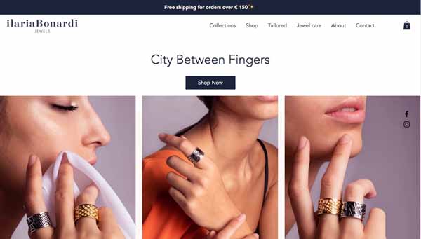
For many businesses, an online store represents the most important aspect of their website. Customers want to easily find and select the items they wish to purchase, and then check out with no hassle.
The ilaria Bonardi Jewels website streamlines each of these steps. For example, it prominently features a “Shop” option in its minimalist navigation menu as well as a “Shop Now” button in its homepage header. It also offers a streamlined checkout process, giving customers the option of clicking a button to make an instant payment via PayPal or making a traditional credit card payment.
Below the header, a grid of three photos showcase featured products followed by interlocked images from a specific jewelry collection with an invitation to browse that collection.
Further down the homepage, a “New Arrivals” section features five product photos against a plain white background. These photos morph into colorful alternative images when visitors scrolled over them.
A subtle, fixed sidebar features social media icons that link to the business’s Facebook and Instagram accounts. Another section near the bottom of the homepage includes a grid of three photos along with an invitation to follow the company on Instagram.
This website’s footer features three columns — “Customer Care,” “Connect,” and “The Company” — plus a call-to-action to subscribe to the company’s newsletter.
Sister Pie (Bakery)
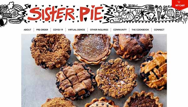
Sometimes, less is more. A homepage doesn’t have to look complicated and include lots of images, menus, and flashy effects to effectively support a business. When you sell variations of a single product, a simple homepage may be the smartest approach.
The Sister Pie website provides an excellent example of how this minimalist approach need not appear underdeveloped. A fixed header features the company’s logo on a banner decorated with whimsical doodles, a “My Cart” button, and an eight-item navigation menu with options like “About,” “Pre-Order,” and “Virtual Demos.”
The rest of the homepage features a single, mouth-watering image of nine different pies and a simple footer with the company name, street address, phone number, email address, and social media icons.
This website’s color scheme also mirrors the simplicity of its content. Splashes of red in the header and a solid red footer with white lettering add visual interest alongside the white background and black text used on the rest of the homepage. This creates an eye-catching, yet simple design.
Extra&ordinary Design (Design Studio)
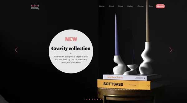
Businesses that deal in aesthetics typically want to feature as many images as possible on their website’s homepage. Photo grids can achieve this goal, but they can require a lot of space. For a cleaner design that still includes plenty of photos, consider using dynamic features like this design studio did.
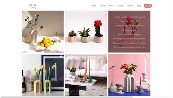
Extra&ordinary Design’s homepage pairs a minimalist, fixed navigation menu with a full-screen slider that rotates through eight, well-staged photos of its products. Below this slider, a grid of six colorful photos showcases even more products. When site visitors hover over each of these photos, an overlay appears with a brief description and a series of hashtags applicable to that item.
This site’s footer features a contact form, a call-to-action to sign up for the company’s newsletter, and social media icons that link to the business’s Facebook, Instagram, and Pinterest accounts.
By using dynamic features, Extra&ordinary Design’s website incorporates plenty of attractive product photos without sacrificing its sleek design.
Casa Vilora Interiors by Veronica Solomon (Interior Designer)
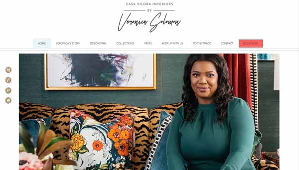
Effective websites must provide more than just photos and social media icons. Their text matters, too.
Some businesses don’t just sell a product or service — they also tell a story. When customers connect with a brand because of its history, values, or vision, they’re more likely to develop brand loyalty. Sometimes, what a company has to say is just as important as what it has to sell.
The homepage of the Casa Vilora Interiors by Veronica Solomon website exemplifies this storytelling approach. While the site features plenty of gorgeous, colorful photos and videos, its design also strongly emphasizes the text. A solid white background, for example, provides a clean foundation for this brand’s story.
In addition, the homepage prominently features a link to the company’s blog, providing an opportunity for potential clients to delve even deeper into this company’s story. A slider of pull quotes from satisfied clients reinforces the site’s overall message.
A fixed sidebar features social media icons in a glittery-gold pattern while an understated footer provides contact information plus links to FAQs and client testimonials.
Hannah Jacobs (Freelance Animator)
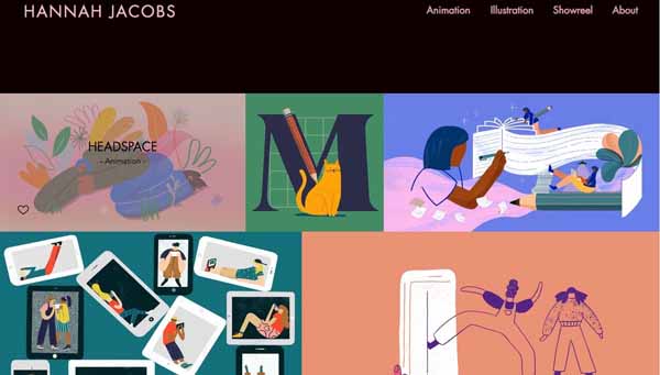
For painters, illustrators, animators, and other visual artists, the primary purpose of their website involves showcasing their work. Blocks of text may prove entirely unnecessary for this type of business owner.
Hannah Jacobs website perfectly illustrates this principle. Beyond its four-item navigation menu, the homepage includes no text. Instead, it features an irregular grid of static and animated art.
When visitors click on an image in this grid, a separate page opens with an explanation of that piece of work and where it appeared. Some animation examples play automatically when visitors open that page while others include a “Play” button.
The site’s simple footer provides social media icons for the artist’s Instagram, Twitter, and Vimeo accounts and nothing more. With its black background, minimal text, and interactive grid of sample artwork, this website has a sleek and sophisticated appearance.
CeliaB (Fashion Brand)
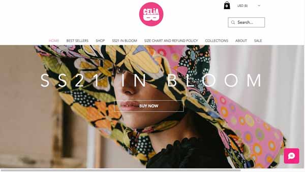
Certain industries, such as fashion, lend themselves to an editorial format.
The homepage for the CeliaB website makes excellent use of this format with the look of an interactive magazine. A parallax effect on the first image continues throughout the homepage and a timed carousel of product style photos adds to the fashion-shoot aesthetic.
The fixed header features the company’s logo and a main navigation menu, making the site easy to navigate, while lush fashion photos in dynamic styles add visual interest and enhance the site’s editorial feel.
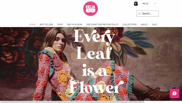
This website also makes excellent use of text. For example, a row of four photos near the bottom of the homepage feature overlays with snappy observations when visitors hover over them. A visually appealing text box also invites visitors to delve further into the brand’s story with a link to its “About” page.
The transparent footer includes a call-to-action to subscribe to the brand’s newsletter along with contact information and social media icons.
Mikaela Reuben (Personal Chef)
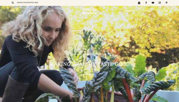
If your business performs a process-based service like cooking, consider creating a website that includes videos highlighting the most photogenic moments of that process. When interspersed with static photos, these videos can add depth and movement to your site’s overall appearance.
Chef-to-the-stars Mikaela Reuben’s homepage beautifully balances a mix of photos and videos. Just below the fixed header, a video featuring Ms. Reuben carefully selecting and placing leafy greens in a basket on a sunny day automatically plays. The text, “Making Healthy Taste Good,” appears as an overlay throughout the video.
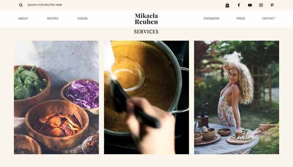
This homepage spices up its photo grids with a few videos that depict Ms. Reuben plying her trade. A video section near the bottom of the home page rounds out the use of the medium.
The New Denim Project (Design Lab and Textile Mill)
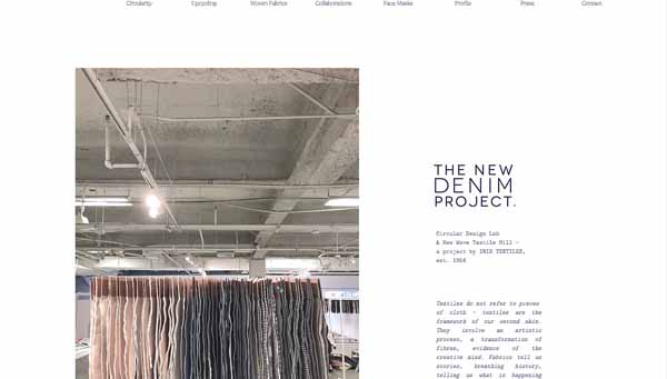
For some businesses, it makes sense to keep their websites as uncluttered as possible. Ample white space serves a purpose on these sites, such as creating a soothing appearance or allowing the images it surrounds to have more impact.
The New Denim Project website follows this principle. A simple header, a single photo, a small text box, a video, and a basic footer with social media icons make up the entirety of its homepage content. The rest is clean white space.
If the thought of populating your homepage with dozens of photos and videos plus lots of flashy effects makes you want to hide in your closet, don’t worry. As this business website illustrates, a minimalist design can feel like a breath of fresh air.
K. Sparks (Musician)
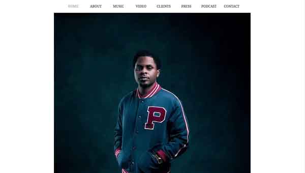
Audio files represent an intrinsic element for some websites. Musicians, voiceover artists, music studios, and other sound-related businesses need websites that offer visitors clear and easy-to-access audio samples.
The website of hip-hop artist K. Sparks handles this need with ease. Its straightforward homepage features a simple navigation menu and a photo of the musician on a clean, white background.
Importantly, the navigation menu includes a “Music” option that opens a page with a grid of Spotify buttons that allow visitors to play clips from K. Sparks’s songs. Visitors can either listen to the featured clips with one click or, if signed into their own Spotify account, play entire songs or albums.
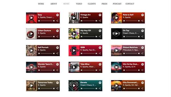
This website also offers a grid of K. Sparks’s videos via Vimeo on the “Video” page — all accessible with one click.
Brandt Maina (Actor)
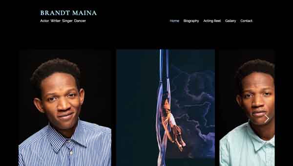
Websites can serve as a resume — especially for individuals who market their talents as performance artists. Yet, these professionals often need a variety of media to properly showcase their abilities, experience, and achievements.
Actor Brandt Maina’s website provides an excellent example of how to incorporate various media types in a clean, attractive, easy-to-navigate space. The homepage presents a solid, black background and a visitor-controlled photo slider while the “Biography” page offers information about Mr. Maina’s acting experience and a button to download his full resume.
In addition, the site’s “Acting Reel” page presents a video that highlights several of Mr. Maina’s acting clips while a “Gallery” page features a grid of compelling photos of him engaged in various roles.
Want to learn more about properly structuring your Wix website? Check out our detailed guide on How To Structure a Website.
Final Thoughts
As these examples demonstrate, you can use the Wix website builder to create a beautiful, professional-looking website for any type of business. Wix offers an array of features to help you design a site that’ll precisely reflect the image you want to present to the world.
To learn more, check out our full Wix Website Builder Review and our Best Website Builders guide to see how Wix ranks when compared to other website-creation tools.
Ready to get started with Wix?
Are you ready to create a website for your business using the Wix website builder? Click below to get started with a free trial.
