12 Examples of Business Websites Built With Web.com
The Web.com website builder is a popular platform because of its ease of use, customizable templates, and streamlined access to thousands of professional, royalty-free photos via Unsplash.
Below you’ll find 12 gorgeous examples of Web.com websites. These examples of effective business websites built using the Web.com website builder represent a range of industries and can help you envision what’s possible with this platform.
Recommended: See what you can build. Get started with Web.com today.
12 Examples of Business Websites Built With Web.com
Web.com is known for being user-friendly and offering a fantastic library of professional images. Through extensive searches we’ve rounded up the top 12 best Web.com websites to use as inspiration for making your own.
If you’re ready to create your own Web.com website, check out our guides:
Generation W (Nonprofit Organization)
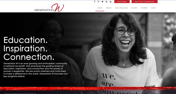
Generation W’s Web.com website makes effective use of color splashes and subtle animation to create an understated, yet attractive appearance.
A fixed header features social media buttons, “Give Now” and “Join Our Community” call-to-action (CTA) buttons, the organization’s logo, and a navigation bar. Drop-down menus in the nonprofit’s signature red hue appear when you hover over the navigation bar items.
A black-and-white photo at the top of the homepage overlaid with a block of text helps the red touches really stand out. Four blocks at the base of that photo, which feature the names of the organization’s four programs, also turn red when you hover over them.
Further down the homepage, several banners highlight content like blog posts and other CTAs. A grid of attractive photos that enlarge slightly when you hover over them link to individual blog posts. A cutout that reveals a stationary, black-and-white photo and more CTA buttons then appears as you continue to scroll down the page.
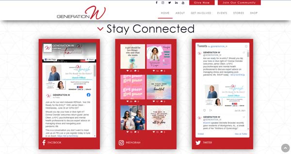
At the bottom of the homepage, a social media section showcases animated highlights from Generation W’s Facebook, Instagram, and Twitter feeds — each ensconced in a red box.
Find everything you need to make your homepage really shine, read our How to Design a Successful Homepage guide.
New York Yacht Sales (Yacht Brokerage)
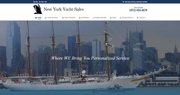
New York Yacht Sales lets the images on its homepage do most of the talking. Beneath an unfixed header, which features the company’s logo and phone number plus a navigation bar, you’ll see an eye-catching photo of a yacht with the New York City skyline in the background. White text fades in over the photo, reading “Where WE Bring You Personalized Service,” to provide a visually attractive introduction to this site.
Below that, a photo gallery features more attractive images of yachts. When you hover over each photo, the image fades slightly to blue, a white line scrolls across the photo, and white text slides in from the right to highlight the boat’s year of manufacture.
Next, a brief block of text explains the company’s offerings followed by a slider with yet more attractive photos of its featured listings. When you hover over each featured listing photo, the image darkens and zooms in slowly while a magnifying glass icon appears. Clicking on that icon will open the pictured yacht’s listing in a separate window.
A final block lists the company’s services alongside small icons outlined in the same shade of blue used throughout this Web.com website.
Perfect Cut Tree Service (Tree Care Provider)
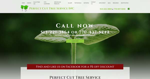
The Perfect Cut Tree Service website built with Web.com features several well-placed photos, blocks of text that offer a wealth of information about the company’s services, and eye-catching animation.
Under an unfixed header that includes a navigation bar plus the company’s logo and contact information, a slider catches visitors’ attention with attractive photos. A text overlay features the company’s contact information and a “Learn More” button.
A block of text follows, using various font sizes and colors that break up the information in a visually appealing manner.
Next comes an “About Us” section with three blocks that slide up into place from the bottom of the screen as you scroll down into the section. The top of each block features a burgundy circle, enclosing an icon related to the service highlighted within that block. These circles change color when you hover over them.
A five-image photo gallery follows. These photos rapidly slide up into place from the bottom of the screen — one after another — as you scroll down into this section. A “View More” button in this section links to a page that provides information about the company’s work.
The website’s homepage ends with a customer testimonials section that overlays yet another eye-pleasing photo and includes a “Read More Testimonials” button.
Kauai Island Destination Weddings (Special Event Planner)
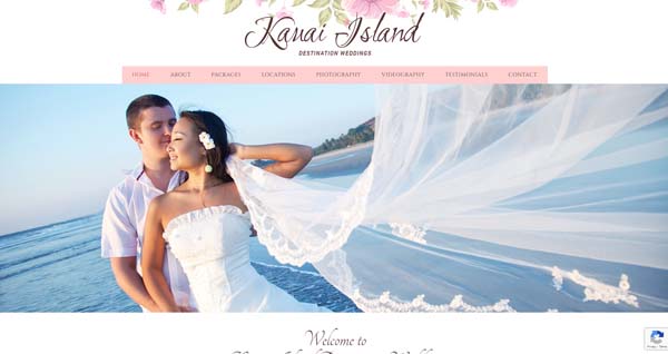
The Kauai Island Destination Weddings Web.com website makes excellent use of a pastel color palette, luxurious photos, and a script font to set a romantic mood.
Under an unfixed header that features a floral graphic, the company’s name, and a navigation bar, a slider of breathtaking photos takes full advantage of the company’s beachy locale.
A short block of text follows under a heading that uses a flowing font reminiscent of calligraphy. The links within the text use the same shade of pink found in the navigation bar.
Next, a grid of four blocks features more romantic photos that represent the company’s core offerings: “Packages,” “Locations,” “Photography,” and “Videography.” Each block includes a transparent “Learn More” button that fills with color when visitors hover over them.
The next section — “What Our Clients Say About Us” — uses a fun, animated effect that makes the lettering of each testimonial scramble and then unscramble into the next.
The homepage ends with a contact form encapsulated in a pink-tinged image of a smiling, photogenic couple in wedding gear.
Chorey & Associates Realty, Ltd. (Real Estate Company)

The Chorey & Associates Realty, Ltd. Web.com website proves that, sometimes, less is more. This site’s simple design boosts its professional appearance.
Under an unfixed header that features a navigation bar along with the company’s logo, social media links, and phone number, a slider showcases appealing photos of suburban homes and their residents.
Below the slider is a grid of five photos paired with the following headers: “Properties for Sale,” “Featured Listing,” “Meet the Team,” “What our Clients Say,” and “Blog/News.” These photos fade slightly when visitors hover over them.
Lastly, a block of text on a white background provides information about the company and its services. A blue footer includes contact information and a series of icons that represent the company’s industry awards.
Top It Off, Inc. (Kitchen Countertops Company)
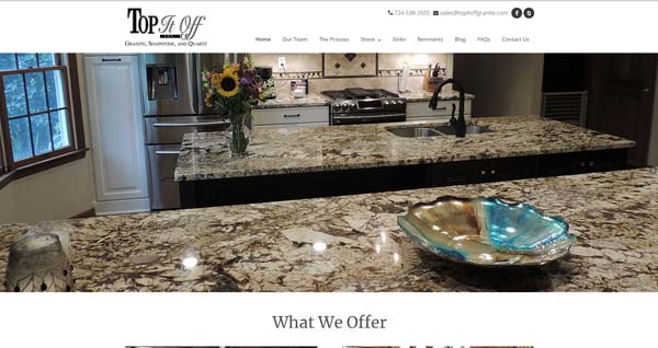
Kitchen countertops company Top It Off, Inc. uses a simple, yet elegant website to highlight the products it offers. An unfixed header includes the company’s logo, phone number, email address, and social media icons as well as a navigation bar. Below the header, a full-screen slider showcases attractive photos of shining granite, soapstone, and quartz countertops.
The “What We Offer” section includes a grid of four more eye-catching photos — each with a label across the bottom. The white-lettered labels sit on top of transparent black strips and link to internal pages on “Getting Started,” “Granite,” “Quartz,” and “Soapstone.” When visitors hover over these labels, they expand to reveal more information.
A block of text on a white background then offers more details about the company and its services. A final banner uses a parallax photo with overlaid text, inviting visitors to “Let Us Top It Off For You!”
Long Island Nail Skin & Hair Institute (Beauty School)
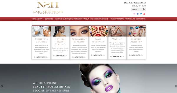
Ideally, a business’s website should serve as an extension of its brand. With glamorous touches and plenty of high-fashion photos, Long Island Nail Skin & Hair Institute’s website does just that.
The glittery gold of the Institute’s logo in the unfixed header repeats throughout the homepage, appearing in linked text and sprinkled in other areas.
A grid of six blocks below the header highlights the Institute’s various courses and training programs. The photos in these blocks zoom in slightly when you hover over them while the linked text turns from gold to black.
Beneath the grid, a slider features several glamorous shots followed by a block of text and a video.
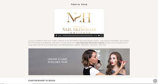
The final section of this site’s homepage presents alternating blocks of linked text and photos, illustrating the services the Institute teaches its students to provide.
Italian Village Pizza (Restaurant Chain)
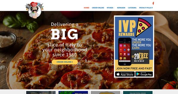
Providing special offers on its Web.com website represents one way a business can maximize the effectiveness of its digital presence. Italian Village Pizza takes full advantage of this approach.
Hovering over the restaurant’s logo in the fixed header on its homepage triggers an animated effect while the same action makes the navigation bar items turn red. A photo slider under the header includes an overlay of white text, an “Order Online” button, and a CTA to download the restaurant’s app.
Next comes a grid of four blocks — “Catering,” “Locations,” “Sign up for Rewards,” and “Online Ordering” — that shrink when visitors hover over them. A block of text follows, providing further information about this regional restaurant chain.
Finally, a banner highlights a special offer for online orders followed by a list of locations, a logo bar of affiliates, and a footer.
Shop Your Way (Discount Membership Club)
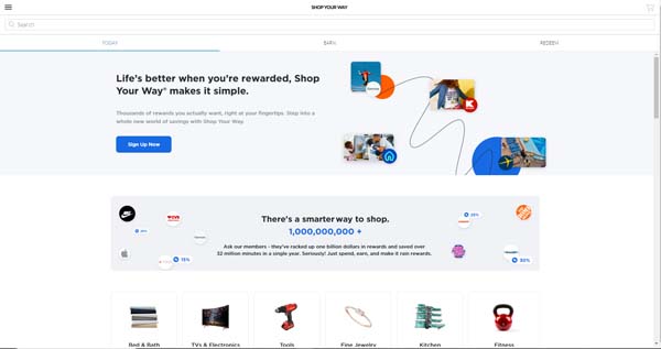
The Shop Your Way website makes excellent use of white space to help draw visitors’ eyes to specific elements.
The site tucks its main navigation menu away in a menu icon in the upper-left corner, which creates a clean, minimalist look. Three tabs fixed at the top of the homepage — “Today,” “Earn,” and “Redeem” — provide the only visible navigation.
Banners feature colorful graphics, company logos, and brief blocks of text.
While the homepage mostly contains grids of product photos or company logos, it also includes gift card CTA blocks designed to look like physical gift cards.
In another grid of boxes containing CTAs, each block gains a shadow effect when visitors hover over them.
Shop Your Way’s Web.com website boasts a simple, uncluttered appearance while still providing plenty of color, CTA buttons, and eye-catching images.
39 Chiropractic & Rehabilitation (Wellness Clinic)
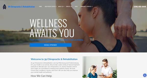
The 39 Chiropractic & Rehabilitation website combines plenty of informative text with well-placed photos and subtle special effects to create an appealing design.
The fixed header blends in with the full-screen photo at the top of the homepage, but it turns white when visitors start to scroll downward. A CTA button at the bottom of that full-screen photo urges viewers to schedule an appointment.
The next two sections of the homepage feature a lot of text, but both include a photo to help break up the design. A grid of blue-filtered, linked photos follows, leading to information on four key topics: “Lifestyle & Nutrition,” “Spinal Adjustment,” “Therapies & Techniques,” and “Stretching & Strengthening.”
Next comes a contact form backed by a photo of a man hiking in a mountainous region, a map showing the clinic’s two locations, and office hours displayed over another hiking-themed photo.
The Sherry Downs Agency (Freight Shipping Company)
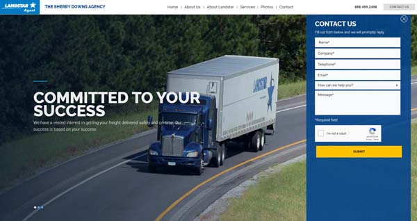
The Web.com website for The Sherry Downs Agency, an independent Landstar agency, uses several dynamic elements to enhance its straightforward layout.
Under a fixed heading, a full-screen photo slider features three images of Landstar trucks overlaid with white text. A “Contact Us” form automatically opens on the right side of the slider, but visitors can close it if desired.
Every block on this site’s homepage includes succinct text, a “Learn More” link, and relevant photos. The homepage also features a single image paired with a “View Photos” link instead of a full photo gallery.
An “About Landstar” block includes a video while a “Landstar Certifications” block highlights logos that represent various industry certifications.
Bangor Drug Company (Pharmacy)
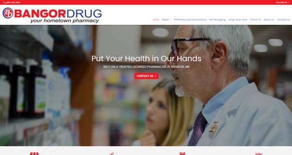
The Bangor Drug Company Web.com website uses several photo effects to add depth to its appearance.
Under a fixed header, a full-screen photo slider offers a “Contact Us” button. Next comes four red icons with the subheads “Retail,” “Pharmacy and Vaccinations,” “Pill Packaging,” and “Long-Term Care.” These icons move slightly upward when visitors scroll over them. A block of text then follows the icons.
The next block features a photo with a parallax effect to provide the illusion of depth. The following block also uses this effect on its filtered background photo.
The homepage ends with a footer in the same red-and-blue color scheme used throughout the site.
While this website has a fairly brief homepage, its use of a photo slider and parallax effects on the largest blocks make it seem more expansive.
Make sure your website has everything it needs to point visitors in the right direction with our How to Design a Sucessful Website guide.
Final Thoughts
As these examples illustrate, you can build a beautiful, professional-looking website with Web.com — regardless of your business type.
To learn more about the Web.com website builder, check out our Web.com Pricing and Plans for Small Businesses and How To Make a Web.com Website articles.
Ready to get started with Web.com?
Get expert guidance and enjoy a professional domain name, free for the first year, when you click the button below.
