How To Make a Website Mobile-Friendly: A Responsive Website Guide
Every day, people use their mobile phones and tablets to search for local businesses. In fact, 63 percent of Google’s traffic comes from searches on mobile devices! As a local business owner or entrepreneur, it’s imperative to make your website mobile-friendly.
This article will guide you through some website design best practices to ensure your website has a mobile-friendly design. By the end, you’ll be ready to make your website mobile-responsive so you can generate more online traffic.
Recommended: Make sure your website builder supports responsive design. Read our Best Website Builder Review to learn more.

What Is Responsive Design?
Mobile-friendly websites usually employ what’s called a “responsive design” approach. If you’re wondering what “responsive design” means, you’re in luck. We’ll not only explain exactly what it is, but also why it’s so important.
For a look at some of the top mobile-friendly website builders, check out our handy Best Responsive Website Builders Review.
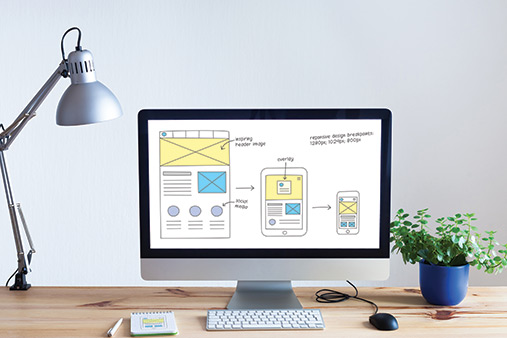
Responsive Design for Beginners
Responsive design is an approach to website design that focuses on ensuring visitors can access websites across a variety of devices. The idea is simple: Your content should display differently based on a visitor’s device to create an optimal user experience. This’ll ensure visitors can access and easily navigate your website no matter what device they use.
Websites that adopt a responsive design approach typically have faster loading times and operate more efficiently. That gives these websites an important advantage over their competitors because search engines prioritize faster websites in their search results.
As a local business owner or budding entrepreneur, you probably already realize the importance of search engine optimization (SEO). That’s why incorporating responsive design into your website is imperative to driving traffic and growing your business.
To learn more about why SEO is an important tool for small business owners, check out our SEO 101 article.
What Are Some Responsive Design Best Practices?
So what are some best practices for applying a responsive design approach to your website? We’ll now walk through the most important aspects of responsive design to optimize mobile experiences on your business site.
By following these guidelines as you build and maintain your site, you can work toward reaching a broader client base while also maximizing online visitor engagement and interaction.
Choose a Mobile-Responsive Theme or Template
The first thing you’ll want to do is choose a mobile-responsive theme or template for your business website. Websites that lack mobile-friendly templates or themes run the risk of driving users away. Why? Even if users can access your website on their mobile phones or tablets, they’re less likely to return if its pages load slowly on their mobile devices.
While slow page-loading times often will repel traffic faster than anything else, most websites were originally designed for web browsers. Finding mobile-friendly or “mobile-first” templates and themes will ensure you build your website with mobile devices in mind — right from the start.
If you already have a website, adopting mobile-friendly themes or templates is a great place to begin optimizing the user experience for your mobile visitors.
Choose a Mobile-Responsive Builder
If you’re still deciding on a website builder, we recommend GoDaddy because all of its templates come mobile-ready. Of course, you should always double-check this feature on your site as you go, but the GoDaddy website builder’s mobile-friendly designs will save you a lot of time and effort in the long run. This is especially true given its reputation for simplicity and ease of use.
If you instead plan to build your business website using a content management system (CMS), such as WordPress, be sure to choose a mobile-responsive theme.
Strip Back Content
You also should prioritize condensing your site’s content wherever you can. Because mobile devices are smaller than desktops, they simply aren’t designed to feature the same complex website content and designs as desktop computers.
The simpler your site design, the better. Your website will load more quickly and work more effectively if you cut back to the basics and prioritize content about your products or services.
Focus on creating content that’s relevant to your business and what it offers. Highlight your products and services with simple, easy-to-understand content. This’ll ensure your website runs efficiently on both desktop computers and mobile devices.
Beyond giving your website greater efficiency and speed, minimizing your content also helps support the different way in which mobile users interact with websites compared to desktop users. A text, phone call, or notification can easily distract them at any moment so you need to prioritize your message and focus on holding their attention for as long as possible. Some good ways to do this involve shortening the forms on your website and avoiding large chunks of text that may bore or distract visitors.
Make Images as “Light” as Possible
While internet browsers on desktop computers can easily display large, high-resolution images, those same images can bog down mobile browsers. As previously mentioned, slower websites are less likely to appear in search engine results pages and more likely to drive away traffic.
It’s important to eliminate any factor that could slow your website down and negatively impact its overall user experience. Making your images as “light” as possible is a great place to start boosting your website’s efficiency.
There are a couple of ways you can make your images lighter. The first involves compressing your images on the mobile-friendly version of your website. Ideally, you should try to aim for images no more than 400 pixels wide. Anything larger runs the risk of slowing your site’s loading time.
You also should consider hosting your videos through a third party like YouTube or Vimeo. This’ll free up space on your server and ensure your website doesn’t slow down when it tries to load videos.
Learn how to properly connect videos to your GoDaddy site by reading our How to Use GoDaddy tutorial.
Avoid Using Flash
Adobe Flash Player is a computer software program that launched in the 1990s. Originally developed to facilitate the viewing of multimedia content, people widely used this software for games, videos, animations, and much more throughout the 1990s and early 2000s.
While it still runs as a plugin on some browsers and a select number of supported mobile devices, Adobe discontinued the software in 2020.
Simply put, using Flash isn’t a good choice if you’re trying to attract people used to the fast pace of modern browsing. Because Adobe discontinued the product and many mobile devices don’t even support Flash, it’s best to avoid using it altogether and instead build a website specifically designed with mobile devices in mind.
Change Button Placement
For improved functionality, you should modify your website’s call-to-action (CTA) button placement to accommodate mobile devices. For example, content shifting can cause users to accidentally click on an unintended CTA button.
Content shifting happens when a web page is loading and the contents of that page shift unexpectedly. Remember to consider this possibility whenever you’re deciding where to place CTA buttons on your website.
In addition to keeping content shifting in mind, you also should focus on placing your CTA buttons near the middle and bottom of the screen. This’ll allow visitors to first scan the page before logically moving toward the button you want them to tap.
It’s also important to rearrange your CTA buttons to optimize the “thumb zone.” Most people use their thumbs for mobile browsing — and many only use one hand. That’s why you need to consider the flow of the thumb zone to optimize your site’s button placement.
Buttons near the middle and bottom of the screen fall nicely into the thumb zone because they’re easy to reach and tap. In contrast, CTA buttons near the top of the screen are hard to reach and less likely to be tapped.
Space Out Links
As we just mentioned, fingers — particularly thumbs — play a huge role in mobile browsing. Because tapping with a finger isn’t nearly as accurate or precise as clicking with a desktop mouse, you need to make your links bigger and more spaced out. This’ll ensure your site visitors can easily access your links and CTA buttons. The last thing you want is visitors struggling to interact with your content.
You should not only avoid placing your links too closely together, but also make sure they’re legible. As a best practice, use different colors or buttons for your links to make them more engaging and to help visitors understand they should tap them.
Use Readable Fonts
Mobile screens are smaller than desktop computer screens so the type of font you use is more important for mobile devices. Try to focus on ensuring your site’s fonts are easy to read so visitors can understand your content on smaller screens.
Fonts used for headers should be at least 16 pixels and secondary texts should be about half that size. You should always view your fonts on other devices to ensure that they’re legible for all visitors — regardless of how they access your site.
Your fonts also should be accessible for readers with visual disabilities. Sans-serif and serif fonts are typically the most accessible fonts so we recommend using a combination of both for your primary and secondary text.
To learn more, check out our Best Fonts for Websites article.
Eliminate Pop-Ups
Pop-up advertisements can prove useful because they grab visitors’ attention quickly. But they simply aren’t as effective on mobile devices. Smaller screens aren’t equipped to handle pop-ups as efficiently as a desktop computer. Pop-ups also can seem disruptive and potentially overwhelming to mobile users.
What’s worse, most people find them annoying and so might leave your site rather than dealing with the hassle of pop-ups. We suggest opting for less disruptive forms of advertising that are less likely to irritate online visitors. You should consider using banner ads or native ads, which fit organically on your website page.
Conduct Regular Testing
It’s always a best practice to test your website regularly to ensure it runs smoothly across a range of devices. We suggest running your website’s URL through Google’s mobile-friendly test to confirm it meets mobile design standards. We also suggest trying your website out on different device sizes to see what kind of adjustments you should make.
Regular testing will ensure your website is as mobile-responsive as you’d like it to be while enabling you to quickly address any problems that might arise.
Final Thoughts
Responsive design has never been more important. To stay competitive, your business needs a mobile-friendly website that’ll help it cater to the needs of its client base.
Because many people use their mobile phones or tablets to search for businesses, your business will miss out on connecting with potential customers who can’t easily access its website.
Before you dig into the finer details of building your site, make sure to start with a mobile-friendly template or theme. If you’re still deciding on a website builder, we recommend using GoDaddy because its templates and themes all incorporate a responsive design.
By ensuring your website is mobile-friendly, you’ll empower your business to attract more traffic so you can take it to the next level.