Checkout Page Design: Best Practices and Examples
When creating and building your business’s website, knowing what type of pages you’ll need can help support the purpose of your site.
This article will help you build one of the best checkout pages as well as provide some checkout page design examples. By the end, you’ll have what you need to gain repeat customers and better sell online.
Recommended: After rigorous testing, we’ve found the GoDaddy website builder to have the best checkout page templates.
Before You Begin
Before you dive in, it’s important to understand which website builder will suit you and your business.
Not all website builders come with everything you may need, and some have better ecommerce capabilities than others. Finding the right one will help clarify how you’ll create your checkout page. Read our Best Website Builder and Best Ecommerce Platforms review articles to get started.
Along with this guide, check out these other articles to learn what it takes to create a comprehensive business website and successful checkout page using various website builders.
Understanding the Goal of Your Checkout Page
The first step in planning and creating a successful checkout page for your online store involves having a good idea of what you’d like to accomplish with it and how you’d like to do so. You can then apply these goals to this page as well as to your business and website as a whole.
Once established, these goals will help you decide how to design your checkout page. They’ll also help you determine how to measure the success of your website and business.
If you need help identifying your business and website goals, our What Makes a Good Website guide is a great resource.
Identifying Your Checkout Page Goals
Even though the goals of your checkout page may seem fairly obvious — to sell merchandise and minimize cart abandonment — it’s still worth taking time to review how they support your business’s purpose and website’s theme.
These goals will vary from business to business, depending on how much they rely on ecommerce. Finding goals that fit your brand can provide a clear way to achieve measurable success.
Here are some questions to ask yourself to help you determine your checkout page goals:
- What type of business do you have? Understanding what kind of business you run will better help you achieve success with your checkout page. If you operate a brewery that makes craft beer, for example, your checkout page’s main purpose might be to increase off-season revenue by selling merchandise. If ecommerce is the sole focus of your business, you’ll instead need a checkout page that successfully encourages customers to complete their purchases. Understanding why site visitors will want to become customers can help inform how you design your checkout page.
- What kind of goods or services do you provide? What your business offers directly relates to what should go into your checkout page. If you’re a jewelry maker with a wide array of products, for example, your checkout page might need to include specific care instructions. If you instead run a small printing studio, you may want your checkout page to notify customers if the item they plan to buy is made to order. Including useful information that also spurs customers to finish the purchasing process will make your checkout page even more successful.
- What kind of growth and engagement do you want? Your checkout page doesn’t have to be the final stop for your customers. It’s always helpful to include a thank-you page after the checkout process. It’s a great way to encourage customers to subscribe to your newsletter, read your blog, or follow your business on social media. This is a good time to consider how you’d like customers to return to your site and continue to engage with you and your brand.
Your answers to these questions will help guide you toward the type of information you want to display on your checkout page. After answering these questions, it’s time to connect your checkout page goals to a tangible way of measuring this page’s success in achieving them.
Using the right website builder for your business can make all the difference. Check out our Best Website Builder review to learn more.
Measuring Checkout Page Success
Identifying your checkout page goals is a great start, but how will you know if you reach them? The best way to ensure you achieve these goals involves setting specific and measurable targets with tangible timelines and relevance.
- Be Specific: A specific goal for your checkout page might involve selling 40 new earring sets. Having a numerical value instead of a general idea can help you better track your success.
- Make It Measurable: A measurable goal for your checkout page could be to reduce the number of abandoned carts by 10 per month.
- Make It Attainable: Be honest and ask yourself if your goals are realistic and reachable. If you have a particularly challenging and/or large goal, break it down into smaller, more manageable milestones.
- Stay Relevant: All of your checkout page objectives should help you reach your website and business goals. Your checkout page should focus on completing the sale of products or services and encouraging customers to return. If you find yourself veering away from this goal, it’s time to circle back to the basics.
- Ensure It’s Time-Based: Setting a deadline for specific goals provides a clear indicator of achievement. If you give yourself one month to sell 100 units of a new book, you’ll know by the end of that month if you succeeded.
Once you have a set of specific checkout page goals with a realistic timeline, it’s essential to ensure they tie back to the overall intention and purpose of your website and business.
Aligning Checkout Page and Business Goals
Now that you have specific checkout page goals, set them next to your business goals. Will your checkout page goals help you achieve your overall business goals? Will your checkout page effectively help you achieve your website goals? If your goals seem to disagree, revise them to ensure they all align with each other.
Once you achieve alignment among your goals, it’s time to dive into what your checkout page will need to succeed. We’ll discuss how content and design can help achieve this.
Still need to clarify the goals and purpose of your website? Read our What Makes a Good Website guide to stay on track.
Determining Your Checkout Page’s Content and Design
Your checkout page definitely won’t be the first page visitors encounter on your website, but it’s still incredibly vital to the success of your business. Its structure should include all the necessary information in a digestible flow.
Adding certain elements to your checkout page can help you better achieve your goal of reducing cart abandonment and encouraging customers to complete their purchases.
Designing the Best Structure
Visitors to your checkout page shouldn’t struggle to find key information so aim to limit any distractions. This page might not be a good spot for a pop-up advertisement, for example, because it could distract and deter customers from finishing the checkout process.
You also may want to avoid a checkout process that requires multiple steps or stages because it can feel overwhelming to customers. That makes a one-page checkout process an optimal structure for success. It not only helps customers quickly visualize everything on the page, but also shows them how close they are to purchasing their desired items.
If your checkout process does happen to require multiple pages and steps, it’s helpful to include a progress indicator as part of your structure. This handy visual shows customers their current place in the process so they don’t feel lost or confused.
Some businesses may want to include a way for customers to save the contents of their shopping carts for a later time. Adding this to the structure of your checkout page can help customers feel more at ease with returning to purchase more later.
Ultimately, the structure of this page should be clear, concise, and easy for customers to understand. Making it easier for visitors to know what they’re buying, how much it costs, and when it’ll arrive will help you achieve your checkout page goals.
For more information, check out our How To Structure a Website guide.
Creating Engaging Content
While the content of this page may seem more utilitarian than the rest of your site, you can still use emotion to connect with your customers and inspire them to complete their purchases. The checkout page is a good spot to highlight information unique to you and your products. Remind customers of why they want to buy from you in the first place.
There’s nothing that’ll cause a customer to disengage with your business more than hidden, extra costs. It’s best not to surprise them at the end of the checkout process with any extra fees. Clearly display your shipping fees, taxes, and any other costs that apply to their purchase before a customer enters their billing information.
Sometimes, a review from a satisfied customer is all it takes to encourage people to buy. Including reviews on your checkout page can incentivize visitors to complete their purchasing journey with you.
Of course, every checkout page should include some specific information. Easy access to your terms and conditions, privacy policy, and any returns policies will help make customers feel confident in purchasing from you.
Use your checkout page to continue to tell your brand story while fulfilling a basic function. It can still show some creativity while encouraging customers to complete their purchase.
Incorporating Key Elements for Success
Beyond the essentials every checkout page needs to achieve its goals — like optimal structure and necessary content — you also can include a variety of other key elements to help minimize cart abandonment.
Here are several useful elements you can add to your checkout page design to promote its success:
- Abandoned Cart Recovery: Many website builders — especially those focused on ecommerce — include abandoned cart recovery in several of their plan tiers. This useful feature sends emails and messages to visitors who left your checkout page without completing their order. It’s a great tool for reducing cart abandonment and reclaiming stock stuck in forgotten carts.
- Images: Product images remind customers what they’re about to purchase. Make sure these images accurately reflect the product and that you have the rights to use them on your site.
- Call-to-Action (CTA) Buttons: While these can take many different forms throughout your site, the CTA buttons on your checkout page should focus on getting customers to purchase. Typically, they’ll read “Pay Now,” “Checkout,” or something similar that directly relates to the purchasing process.
- Internal Links: These embedded links help visitors navigate your entire site with ease. Great uses of these links within a checkout page might take visitors to a set of frequently asked questions (FAQ), your Terms and Conditions page, your customer reviews, and your site’s Privacy Policy page.
- Chat Boxes: This feature provides a tool site visitors can use when they need help — an especially useful element on a checkout page. Use a chat box to make it easy for visitors to contact your customer support or have a list of commonly asked questions ready to go in the chat.
- Guest Checkouts: While it may seem tempting to require visitors to become members to finish their purchase, this can cause many people to abandon their carts. By offering a guest checkout option, you can increase the likelihood of visitors not only finishing their current orders, but also returning to become a member for faster checkout in the future.
- Multiple Payment Options: Most website builders will enable your site to accept several payment methods, such as major credit cards, PayPal, Venmo, and more. Offering your customers more ways to pay will increase the likelihood that they’ll complete their transactions.
- Mobile-Friendly Functionality: Again, most website builders will enable you to optimize your site for mobile devices, but it never hurts to double-check. The ability to allow customers to easily make purchases from a mobile phone or tablet will help you increase sales and decrease cart abandonment.
- Trust Badges: These helpful icons let customers know their data will remain secure. Clearly displaying them on your checkout page will help put customers at ease when entering sensitive, personal information during the purchasing process.
- Progress Indicators: If your checkout process includes several steps or pages, you should consider adding a progress indicator to let customers know their current location within this process. These most often appear as a type of bar along the top of the screen with a clear indication of the customer’s current stage in the process.
- Input Error Notifications: Letting customers know when they accidentally skip a vital step or enter incorrect information into a field will save them the headache of having to start over. Input error notifications instantly alert customers that something went wrong with the information they entered, allowing them to immediately fix the issue.
- Pop-up Windows: While not recommended during the checkout process, pop-up windows can prove useful after a customer completes their purchase. For example, you might use one post-checkout to present an exit-intent survey to collect more data from your customers. Alternatively, you might use a pop-up window to deliver a thank-you message with links back to your website or even a discount code for a future order.
- Social Media Icons: Including social media icons in your site’s header and footer will make them constantly accessible to visitors. This’ll help encourage them to access and follow your business’s feeds where you can highlight your products in action and display more images of your offerings.
Adding these elements to your checkout page gives you several tools to help convince visitors to make a purchase while also enhancing your site’s overall user experience.
Reviewing Successful Checkout Page Examples
Sometimes it’s easiest to see success in action. Here are examples of some of the best checkout pages built using various website builders. Along with at least one visual for each, we’ll also explain what makes them so effective.
Successful GoDaddy Checkout Page Example
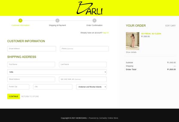
Based in Delhi, India, clothing brand Darli does several things really well on its checkout page. First, an image of the item appears on the right-hand side of the screen along with an itemized invoice that includes the subtotal, a blank space for shipping, and the order total. The space for shipping will update once a customer enters the appropriate information so they know what to expect before completing their purchase.
Second, Darli includes a progress indicator at the top of the page because its checkout process requires three steps. This clearly shows a customer’s location within the checkout process.
Third, the page provides an option for members to sign in just below the progress indicator. This enables customers who already have an account to skip the bulk of the checkout process and quickly finish purchasing their item. While it doesn’t pressure new customers to create an account to finish the checkout process, it may provide incentive to do so.
Overall, this checkout page helps customers complete a simple, streamlined, and straightforward process to boost the company’s online sales.
Learn how to create your own successful GoDaddy site with our How To Make a GoDaddy Website guide.
Successful Wix Checkout Page Example
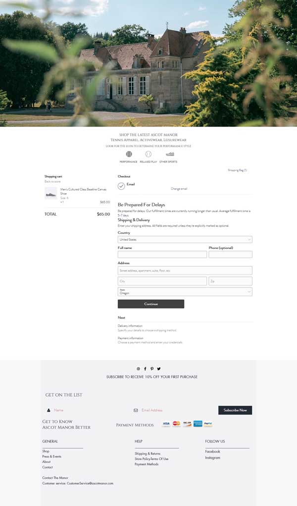
Tennis apparel company Ascot Manor does a great job of providing quite a bit of information on its checkout page in a very digestible way. For example, it includes an image of the customer’s chosen item as well as a brief disclaimer that alerts them to potential delays in the shipping process.
Below the shipping information form, customers will find a “Continue” CTA button. Beneath that, a modified progress indicator lets them know the next steps include entering delivery information and then payment information.
This checkout page’s footer also includes a range of useful tools. It prominently displays social media icons, encouraging visitors to follow the business on several platforms. In addition, a CTA button invites visitors to subscribe to the company’s email list to receive a discount on their first purchase — a great way to incentivize them to become customers.
Importantly, this checkout page also clearly lists all accepted payment methods. This not only informs visitors of their payment options, but also highlights that this business accepts a wide variety.
Finally, the footer includes internal links to shipping and returns information, store policies, and ways to contact customer service. This makes it even easier for visitors to get in touch with any questions.
Overall, this checkout page provides a great example of how to reduce cart abandonment and encourage shoppers to complete their purchase.
Learn how to create your own successful Wix site with our How To Make a Wix Website guide.
Successful Shopify Checkout Page Example
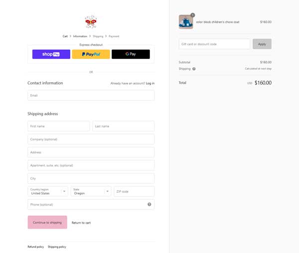
The small team of creative professionals behind Psychic Outlaw craft unique, handmade items from vintage textiles. Because this business offers both premade pieces and made-to-order items, its checkout page has several important elements.
At the top of the page, just below the logo, visitors will find three options for quicker ways to pay. If they already saved their information to PayPal or Google Pay, clicking on one of those buttons will let them skip the laborious process of entering their payment details. This can help speed up the process and bring visitors one step closer to becoming customers.
This page also gives people the option to log in if they’re a Psychic Outlaw member or returning guest. This can help encourage people to return, knowing the site securely saved all their information for the next time.
Underneath the item image, this page prominently displays a field in which customers can enter and apply a gift card or discount code. That location makes it very easy to access.
By clicking on the question mark next to the “Shipping” section, visitors can open a pop-up window that clearly outlines the company’s shipping policies. This quickly answers most questions customers may have about this policy and gives them an estimated delivery time for their item. It also includes several ways to contact the team if a customer needs further support.
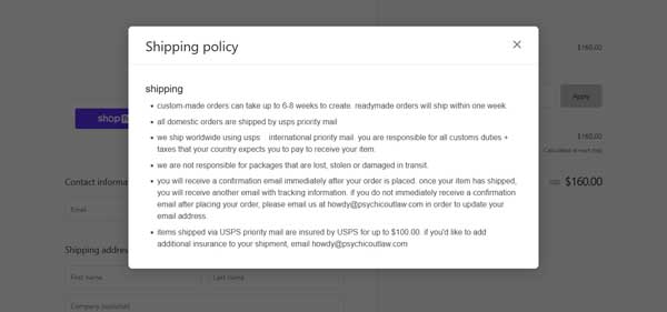
Links to the company’s refund and shipping policies appear at the very bottom of the checkout page. Both open pop-up windows when clicked and provide key information as well as contact details should a customer need assistance. They represent yet another great way to provide useful information and encourage visitors to complete the shopping process.
Learn why Shopify is our top choice for ecommerce website builders in our Best Ecommerce Platforms article.
Successful WordPress Checkout Page Example
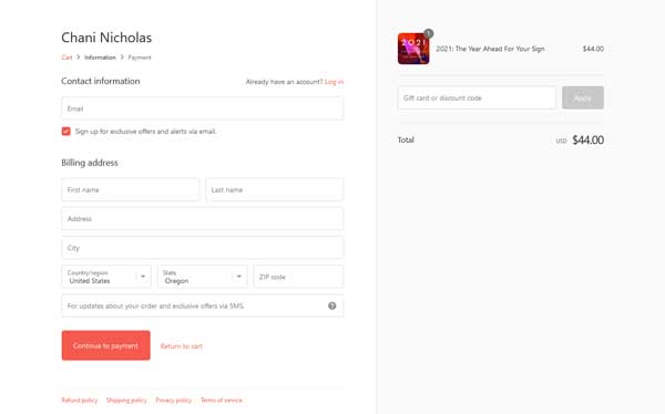
The team behind astrologer Chani Nicholas created a simple, yet beautiful checkout page.
A progress indicator at the top tells customers their current location within the checkout process. Below this, the page provides an area where account holders can log in. The first part of the contact information section includes a space for customers to enter their email address with a box already checked to automatically sign them up for the business’s email list.
While the contact information form is fairly straightforward, this page automatically uses the details entered there as the customer’s billing address. This speeds the checkout process by ensuring customers don’t have to provide essentially the same information more than once.
The form also gives people the option of providing a phone number if they want to allow customer service to text them with order updates. This useful feature can help instill peace of mind in potential customers.
Two CTA buttons appear on the page: “Continue to payment” and “Return to cart.” These make it easy to navigate the entire checkout process if a customer changes their mind or needs to add more items.
The bottom of this checkout page features links to the business’s refund, shipping, and privacy policies as well as its terms of service. These internal links make it easy for customers to find this important information.
Learn how to create your own successful WordPress site with our How To Make a WordPress Website guide.
Successful Weebly Checkout Page Example
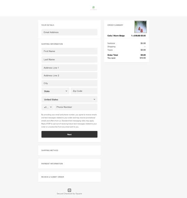
Polymer clay accessories company Palm and Kiwi Co. keeps it simple with a clean design on its checkout page.
Within the order summary, a price strikethrough feature highlights the current item is on sale and quite a good deal. This helps encourage visitors to complete their purchases, knowing they’ll save money.
A disclaimer within the form tells visitors the company will only use the information they enter, such as their email address and phone number, if it needs to contact them regarding their order. That disclaimer also includes instructions for how customers can opt out of this, if desired.
Below the “Next” button, a list of the other steps within the checkout process helps customers orient themselves and know what to expect when moving forward.
At the bottom of the page, a “Secure Checkout by Square” icon lets customers know the business will safeguard any information they enter here. It’s a great way to build trust and encourage people to purchase items from this small shop.
Learn how to create your own Weebly website with our How To Make a Weebly Website guide.
Successful Squarespace Checkout Page Example
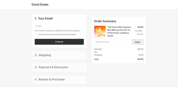
The artistic power couple behind Good Snake uses several tactics to streamline their site’s checkout process. First, they skip the shopping cart stage and instead allow customers to head straight to checkout from their “Shop” page. Visitors can simply click on the item they want to buy, clarify the quantity they want, and then click on the “Purchase” button to instantly reach the checkout page.
Once at the checkout page, they’ll encounter an intuitive, four-step process. The order summary — which includes an image, a discount code field, and the total — always remains on the right side of the screen. Once a visitor enters the necessary information to move forward to the next step, the section they just completed collapses and the next section opens.
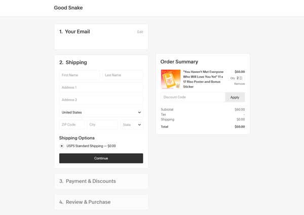
This design makes it easy for customers to go back and edit any information they already entered. Moreover, keeping all the steps on one page simplifies and streamlines the entire process to help convert visitors into customers.
Get inspired to build your own Squarespace website by checking out these other Squarespace website examples.
Final Thoughts
Now that you have the tools to begin creating a successful checkout page for your business or ecommerce website, it’s time to find the right website builder. Read our Best Website Builder and Best Ecommerce Platforms review articles to determine which platform will work best for you and your online business.
Check out these other articles to learn more about how to create a successful business website and achieve your business goals:
